| Image |
Comment |
| 05/01/2005 11:22:38 PM |
Writing a Love Poemby admart01Comment: Very nice composition and typography. You've done a great job capturing sparkle in the diamonds without going nuts with diffraction spikes. Having the ring face the camera so perpendicularly seems to flatten it though. This is an awesome layout. (8) |
 Photographer found comment helpful. Photographer found comment helpful. |
| 05/01/2005 11:18:27 PM |
Round Brilliant Two-Tone Ringby mocabelaComment: This is a very striking image and layout. I like the use of the strong light/dark division to emphasize the two-tone silver and gold. You've captured great detail in the gems and settings. Excellent. (9) |
| Photographer found comment helpful. |
| 05/01/2005 11:11:32 PM |
Iceby bruskiComment: I really like the layout of this as an ad. The two-tone color scheme is perfect. I'm sure the narrow depth of field, keyed on the stone is intentional, but I feel like having just a bit more of the ring in stronger focus would be helpful. I do agree that having the back of the ring softened is a good call for the feel of the ad. (7) |
| Photographer found comment helpful. |
| 05/01/2005 11:05:39 PM |
The Perfect Settingby ChasSourekComment: You've captured some very nice, subtle color in the rings--the blue with just a hint of orange. You've created a clean, balanced layout that I think would work very well as an advertisement. The nearly lost lower edge of the upper ring bothers me a littel bit though. (8) |
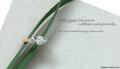
| 05/01/2005 11:00:53 PM |
Foreverby BobsterLobsterComment: I really like the layout, color, and amazing background. The rings seem to suffer a bit from either glare or soft focus--in all likelihood that's intentional, it's just that my eye wants to see just a bit more crispness in some part of them. Still a beautiful photo. (7) |
| Photographer found comment helpful. |
| 05/01/2005 10:56:24 PM |
Gruenby graphicfunkComment: This has such a pleasant, warm feel to it. The strong right-angle structure of the layout seems to contradict the "curved...contour" description in the text, but visually, the image and text make for a very strong graphic. (8) |
| Photographer found comment helpful. |
| 05/01/2005 10:49:51 PM |
February by nico_blueComment: I really like the background pattern you set up and how nicely it reflects in the ring. Great decision to selectively lighten the background--it looks classy. (8) |
| Photographer found comment helpful. |
| 04/29/2005 09:11:38 PM |
Go Aheadby StrikeslipComment: Your use of focus, composition, cropping and color are excellent. The purple/yellow compliment is very pleasing. The crop, focal plane, and angle of the ring are very suspenseful. I wish the diamond was a bit more in focus. The text is arranged and indented well for the image, but I think the font is too big for the elegant look of the picture. (I'd really like to see what this looks like with a different font treatment.) Beautiful shot. (8) |
| Photographer found comment helpful. |
| 04/29/2005 08:52:23 PM |
Omega DeVille Automatic Chronometerby fplouffeComment: Beautiful, flawless shot. Nice use of the glossy base and reflection. I notice you made sure the hands were in the 2:00/10:00 beauty positions :D I'm not sure how intentional the light/dark background reflection was in the face of the watch, but I think it does help give a nice clean look to the finish of the crystal. Great work. (9) |
| Photographer found comment helpful. |
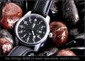
| 04/28/2005 07:22:23 PM |
History In The Makingby RedOakComment: Very nice composition, color, and choice of setting for the watch. The glistening drops and smooth edges do a good job of complimenting the glossy reticulation in the watch.band. There's great contrast and sharpness throughout the image, and because of the way you've arranged the reddish stones, you still draw attention in to the watch, even though there is rich interest in the stones. (9) |
| Photographer found comment helpful. |
Home -
Challenges -
Community -
League -
Photos -
Cameras -
Lenses -
Learn -
Help -
Terms of Use -
Privacy -
Top ^
DPChallenge, and website content and design, Copyright © 2001-2025 Challenging Technologies, LLC.
All digital photo copyrights belong to the photographers and may not be used without permission.
Current Server Time: 08/02/2025 10:44:54 AM EDT.