| Image |
Comment |
| 04/30/2005 12:22:46 AM |
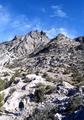
Glassford Hillby justineComment: judging by your title the hill is the subject of your picture but the challenge describes that the subject must also be the strong point of your image. in this case, the clouds seem to have taken control of the picture as the strong point. nice concept and i know you cant control the weather. |
 Photographer found comment helpful. Photographer found comment helpful. |
| 04/30/2005 12:19:51 AM |
Duskby luv2photoComment: i dont think that this picture fits the theme at all:
"Create an image where your subject is the strong point of the image, but only occupying a very small portion of the image space."
while your subject IS the strong point of your image it does NOT take up a small portion of the image space. overall it is a well taken shot and i nice idea, but not for this challenge |
| 04/30/2005 12:17:06 AM |
The Hikerby justin_hewlettComment: this photo did not score too well with me, but it is not a bad photo at all i just dont think it fits the theme:
"Create an image where your subject is the strong point of the image, but only occupying a very small portion of the image space."
although the person in the bottom left of the frame is what YOU want your subject to be, i think that the hilltops snatch the viewers attentition away from the hiker. some of the rocks also seem a bit overexposed giving the picture a harsh look. sorry but this one got a 5 |
| Photographer found comment helpful. |
| 04/30/2005 12:12:30 AM |
im sorry old friendby WisheComment: i can see where you were trying to go with this photo but i think that the vibrant colors take away from the minimalism theme. the colors are very distracting from the obvious focus point of the photo. it looks like you tried to blur the edges of the flower but that makes the picture look sloppy to me. i think your best bet for this picture would be to try it in b&w. i gave it a mild score because of the distracting color. sorry but i hope i explained myself |
| Photographer found comment helpful. |
| 04/30/2005 12:07:57 AM |
Flower Powerby AlbireoComment: nice idea but i think the texture of the rock draws the viewers eyes away from the flower
fits the theme perfectly and a nicely taken shot |
| Photographer found comment helpful. |
| 04/29/2005 10:10:56 AM |
Wood Pigeonby BooZonComment: im not sure if you were trying for a silouette or if this shot is severely underexposed. the branches look allright but the bird is way too dark to be a regular shot but if it was a true silouette you would not have any detail on the front of the bird |
| Photographer found comment helpful. |
| 04/29/2005 10:08:27 AM |
Miss Noseyby roadrunnerComment: good thing that there arent any boogers!! nice shot and i like the b&w....8 |
| Photographer found comment helpful. |
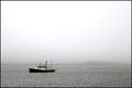
| 04/29/2005 10:06:31 AM |
mooringby byoungComment: its a beautiful day in the neighborhood.... this is about the 5th picture that i have seen that has been fouled by wonderful weather. i think the fog does help this picture but it drains the color out of the water and there is obviously no sky. it looks like you saturated the color on the boat to make it stand out (which was needed). my only other gripe is that i may have tried to remove the bouey (spelling?) but an overall great concept and awesome shot, too bad i live in a landlocked state. high score |
| Photographer found comment helpful. |
| 04/29/2005 10:02:03 AM |
My Little Sushiby rlinn3Comment: some of the ingerdients if the sushi look a bit overexposed but it is a great shot that fits the theme might have scored higher if the lighting was fixed and the sushi was a little smaller/farther away but an 8 is nothing to cry over |
| Photographer found comment helpful. |
| 04/29/2005 09:59:54 AM |
door knobby robadsyComment: great color, great lighting great fit in the theme
it looks like you used two light sources to shoot this picture and my only complaint is that you may have wanted to try a third to eliminate the shadows of the doornob or have them 180 degrees apart from each other. GREAT SHOT though.....9 |
| Photographer found comment helpful. |
Home -
Challenges -
Community -
League -
Photos -
Cameras -
Lenses -
Learn -
Help -
Terms of Use -
Privacy -
Top ^
DPChallenge, and website content and design, Copyright © 2001-2025 Challenging Technologies, LLC.
All digital photo copyrights belong to the photographers and may not be used without permission.
Current Server Time: 08/04/2025 09:44:03 AM EDT.