| Image |
Comment |
| 03/30/2005 08:16:07 PM |
modern mausoleumby BeetleComment: This is my second go-around =) - your photo looks good, it just really does not stand out to me. However, I like your take on the challenge and I think you have a good idea here =) |
 Photographer found comment helpful. Photographer found comment helpful. |
| 03/30/2005 08:14:36 PM |
PEACEby justinbrookComment: This is my second go-around =) - I like your take on the challege. I think that the composition is not as strong as it could be. Your title leads me to believe that the Peace tombstone should be the focus of the photograph, so maybe using depth of field to blur the background a little or zoom in on the Peace tomstone a little more. Otherwise, nice photo! =) |
| Photographer found comment helpful. |
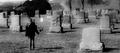
| 03/30/2005 08:11:34 PM |
A Moment Of Silenceby beautyqn25Comment: This is my second go-around =) - I really like your take on teh challenge! Very meaningful. Great use of b&w, excellent contrast! And I love yoru composition! Great job!!! =) |
| Photographer found comment helpful. |
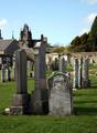
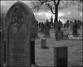
| 03/30/2005 08:10:43 PM |
Glasgow Necropolisby TallblokeComment: This is my second go-around =) - I really love the location! Looks a little cluttered though... I do not know what to look at first or what the subject matter really is. However, I love your use of black & white, excellent tones and contrast! It really stands out! Great job! =) |
| Photographer found comment helpful. |
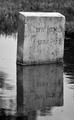
| 03/30/2005 08:09:36 PM |
Watery Graveby moodvilleComment: This is my second go-around =) - very nice! I really like the reflection in the water... very nice use of b&w - your grey scale and contrast look excellent. Great job! |
| 03/30/2005 08:08:48 PM |
Shadowsby MikeOComment: This is my second go-around =) - I really like your idea! Nice take on the challenge. Also, great use of black and white. |
| Photographer found comment helpful. |
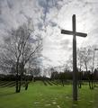
| 03/30/2005 08:07:57 PM |
Their sacrifice rememberedby sidpixelComment: This is my second go-around =) - I really like your composition. The sky looks great! I only wish you could have brought out the blues more... I think it would have really added to your photograph. Otherwise, great job! |
| Photographer found comment helpful. |
| 03/30/2005 07:15:49 PM |
From Aboveby GolferDDSComment: This is my second go-around =) - I really like your creativity in taking a shot from above. I would have liked to see it not cropped as tightly and maybe a little more contrast. But as is I think it's a good photograph =) |
| Photographer found comment helpful. |
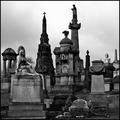
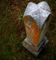
| 03/30/2005 07:11:06 PM |
Resting Placeby peeceeComment: This is my second go-around =) - I really like your subject and composition. For some reason, i think your photo looks too grey (you may have intended this). I just feel that there should be a little more contrast and some highlights so it doesn't look as flat. But I really like your idea and I really like the location you used =) |
| Photographer found comment helpful. |
| 03/30/2005 07:09:16 PM |
Insomnolenceby jenesisComment: This is my second go-around =) I love the location you chose! For some reason, I just think that the foreground (very bottome of the picture) looks very blurry- it's a little distracting. Also, I think you may have burned the corners a little too much... it's a great idea to do for your composition, however, next time I would not burn as much. Otherwise, I really like you photo! Great job! |
| Photographer found comment helpful. |
Home -
Challenges -
Community -
League -
Photos -
Cameras -
Lenses -
Learn -
Help -
Terms of Use -
Privacy -
Top ^
DPChallenge, and website content and design, Copyright © 2001-2025 Challenging Technologies, LLC.
All digital photo copyrights belong to the photographers and may not be used without permission.
Current Server Time: 08/01/2025 09:30:08 PM EDT.