| Image |
Comment |
| 04/06/2005 01:32:09 AM |
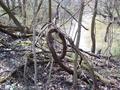
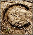
cursive eby booneComment: A closer crop would have brought my attention to the E better. |
| 04/06/2005 01:31:11 AM |
|
| 04/06/2005 01:29:30 AM |
|
 Photographer found comment helpful. Photographer found comment helpful. |
| 04/06/2005 01:27:40 AM |
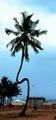
CoCoNUtS (-:by IniLComment: LOL, great title, weird tree, just a little out of focus maybe. |
| 04/06/2005 01:26:27 AM |
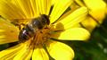
H is for Honeybeeby gwendyComment: Nice photo, I wish my colors came out that clear! I dont see a letter though, but oh well nice photos deserve nice scores! |
| Photographer found comment helpful. |
| 04/06/2005 01:25:03 AM |
|
| 04/06/2005 01:22:01 AM |
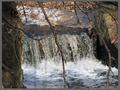
Phantom Lettersby JordanZComment: I see a blurry streak towards the left side and ir is distracting. Also the branches take away from the focus on the waterfall, all my eyes want to see are the branches. |
| Photographer found comment helpful. |
| 04/06/2005 01:19:28 AM |
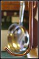
OOO'sby joansuzyComment: Nice, maybe a little less light reflection on the candy would have made this easier to look at- |
| 04/06/2005 01:18:17 AM |
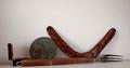
All You Needby outlandComment: creative for sure. the background is a little lacking to me though. |
| Photographer found comment helpful. |
| 04/06/2005 01:16:55 AM |
X-Factorby biggood53Comment: I think the crop is to close and I can't really focus on the X. |
Home -
Challenges -
Community -
League -
Photos -
Cameras -
Lenses -
Learn -
Help -
Terms of Use -
Privacy -
Top ^
DPChallenge, and website content and design, Copyright © 2001-2025 Challenging Technologies, LLC.
All digital photo copyrights belong to the photographers and may not be used without permission.
Current Server Time: 07/30/2025 12:06:15 PM EDT.