| Image |
Comment |
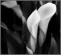
| 05/26/2007 12:03:25 PM |
Two Conesby admart01Comment: I think the B/W hurts the overall picture. The contrast between the white and the green is usually what makes these flowers stand out. You've taken away some of the 'punch' by choosing to go B/W. |
 Photographer found comment helpful. Photographer found comment helpful. |
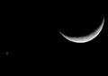
| 05/26/2007 12:01:21 PM |
Crecent+Evening'Star'by ralphComment: I think it would have been better without the star. My focus keeps going to the star. Nice exposure on the moon. |
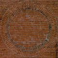
| 05/26/2007 11:57:23 AM |
Weighty Circleby musicman69Comment: Metal is a tough subject. You've got a glare at the top left that distracts from the overall picture. A raking light might have shown off the texture a little better. |
| 05/26/2007 11:38:49 AM |
circle of confusionby ananddpComment: It's hard to tell what this item is. That hurts your score a little. The washout is pretty harsh and your lighting is off center. Could have been an interestign shape if you had shown more texture. |
| 05/26/2007 11:35:45 AM |
|
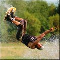
| 08/06/2006 07:22:04 AM |
Dude! by zardozComment: This will be the only high scoring photo that I comment on (I've been concentrating on those that need critiquing). Your shot IMO should be a ribbon winner. I really can't find anything wrong with this shot . . . well, maybe if you would have had more lake in the picture, it would be better. Sort of looks like he's skiing on grass. Congrats on such a great photo. |
| Photographer found comment helpful. |
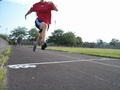
| 08/06/2006 07:17:15 AM |
boy in waterby -kipComment: This one was close. I wanted to score it higher, but the water is too washed out. It looks more like a white wall than water. |
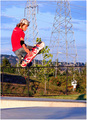
| 08/06/2006 07:14:16 AM |
Later Skaterby ShannonLeeComment: The background is a big distraction on this one. Looks really 'busy'. Good action though. Did you saturate colors at all? The red shirt and blue sky look a little over-saturated. |
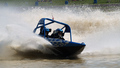
| 08/06/2006 07:11:22 AM |
Pat's Diamondby AngryVatoComment: Nice Action shot. The exposure is a little too dark in the shadows. It looks like this was taken with a high sun, making it tough to get the exposure right. I'm guessing that if you lightened it up, the water would look washed out. Try a tighter crop. The water action behind the boat will still be there, and you'll be able to bump up the exposure to see more detail in the shadow. |
| 08/05/2006 09:17:18 AM |
And the winner is...by yomanComment: Wait . . . who's the winner. You chopped their head off. The photo really doesn't work without the head (sorry). |
| Photographer found comment helpful. |
Home -
Challenges -
Community -
League -
Photos -
Cameras -
Lenses -
Learn -
Help -
Terms of Use -
Privacy -
Top ^
DPChallenge, and website content and design, Copyright © 2001-2025 Challenging Technologies, LLC.
All digital photo copyrights belong to the photographers and may not be used without permission.
Current Server Time: 08/20/2025 02:18:29 PM EDT.