| Image |
Comment |
| 04/15/2005 11:04:00 PM |
|
 Photographer found comment helpful. Photographer found comment helpful. |
| 04/15/2005 11:02:22 PM |
Dayton (My First Entry)by jdw_picsComment: Cute kid. I can see the building a little, but this turned out to be more of a picture of Dayton. It is a very nice picture of him though. |
| 04/15/2005 11:01:03 PM |
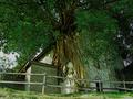
So Oldby clarklensComment: Okay, I'm guessing you live somewhere close to another DPC'er. I've seen this in another photo. But I do like this view much better. This really is just an awesome sight. The color is good and so is the contrast. I wouldn't have put the tree dead center though. A good photo though. |
| Photographer found comment helpful. |
| 04/15/2005 10:57:31 PM |
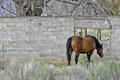
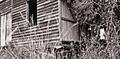
Yesterday's Homesteadby bclementsComment: Sorry, but I don't care for the horses behind. You just can't help seeing in every time you try to look at the rest of the photo. |
| Photographer found comment helpful. |
| 04/15/2005 10:55:56 PM |
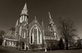
St. Joseph's Churchby hopperComment: I don't think the fisheye works well for this. I like the building though and you did a good job balancing the light trim with the darker brick. |
| Photographer found comment helpful. |
| 04/15/2005 10:54:30 PM |
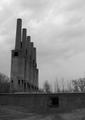
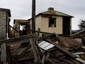
Shadows of the pastby ThelmaComment: The pole in the middle really looks out of place in this photo. I doubt there was much you could do in the way of a different viewpoint. I think brightening the photo just a touch would have brought out a little more detail in the building that's standing. |
| 04/15/2005 10:52:21 PM |
|
| Photographer found comment helpful. |
| 04/15/2005 10:48:40 PM |
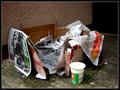
Up and On To Bigger Thingsby nohareComment: Sorry, I just can't agree that this fits the theme of the challange. Interesting composition though. The cup in the front is a little burned out. |
| Photographer found comment helpful. |
| 04/15/2005 10:46:57 PM |
Mean Buildingby fenriqComment: Not a very interesting corner, but your skill shows in it. Good color saturation and composition (for what you chose to work with) |
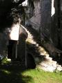
| 04/15/2005 10:45:46 PM |
Stairway to Heavenby diogenes350bceComment: So close. I think if you would have chosen a different time of day to shoot this, it would have been a lot better. As it stands, the patchiness of the sun is distracting. I also might have tried to move a little to the right to try and chop out the tree on the left side. |
| Photographer found comment helpful. |
Home -
Challenges -
Community -
League -
Photos -
Cameras -
Lenses -
Learn -
Help -
Terms of Use -
Privacy -
Top ^
DPChallenge, and website content and design, Copyright © 2001-2025 Challenging Technologies, LLC.
All digital photo copyrights belong to the photographers and may not be used without permission.
Current Server Time: 08/21/2025 02:17:12 AM EDT.