| Image |
Comment |
| 10/05/2006 08:05:50 PM |
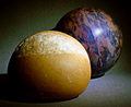
Rock and Rollby robinssongComment: Perfectly on target with the theme. Great idea/title. Nice composition, balance and crop. Sharpness seems almost on the plus side but too close to call. My only suggestion would be to play around with a little "rockier" looking rock that was closer in color value to the roll. Might be be interesting to have more of the contrast in the subject and less in the color, but that's just an idea. Really good work. Score 9! |
 Photographer found comment helpful. Photographer found comment helpful. |
| 10/04/2006 09:42:49 PM |
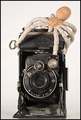
The Real Thingby m2iwComment: Ahhhhh. Now I see it.
Checking back on the setup details of th shot...
I thought it might be a Coke can, the logo was definitely there, but then the dots on the screening of the red printed area sure looks to me like some type of cloth material. Being fairly sure Coke is not distributing soft drinks in denim (yet), I was very confused. For a time. Still concur with my earlier opinion that it is a very well put together image.
|
| Photographer found comment helpful. |
| 10/04/2006 07:07:16 PM |
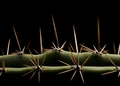
Valley of Thorns by labudsComment: Ouch. It hurts to look at, even after a half dozen time. :-)
Congratulations! |
| 10/04/2006 07:01:29 PM |
Dance of the fairies! by JudiComment: Hearty congratulations, Ms. Liosatos. This is a really, really, lovely shot. I'm saving my pennies and ordering a print which I've never done before. |
| Photographer found comment helpful. |
| 10/04/2006 06:55:12 PM |
Mitosis by yankoComment: Well deserved Blue Ribbon! Congratulations, Mr. Toro.
|
| Photographer found comment helpful. |
| 10/02/2006 08:13:17 PM |
|
| Photographer found comment helpful. |
| 10/02/2006 08:08:30 PM |
|
| Photographer found comment helpful. |
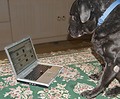
| 10/02/2006 08:06:19 PM |
Rufus checks on challengesby griz210Comment: Funny picture and title. This really looks sharpened, though, a lot. The direct flash seems a little too harsh. Maybe that's what I'm seeing with the rest of the shot. It just seems a little too edgy. If you didn't use bounce flash, that would be a suggestion. I'm definitely no flash expert, but if it was direct and not bounce, I think a bounce might give the screen some more contrast, too, which might be a good thing. I really like the way the trackball came out, it looks like it's floating or 3d or something really dimensional. Oh, one other thing, and this is really picky, but I would have capitalized the "C" in Challenges if you're referring to DPC. |
| Photographer found comment helpful. |
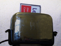
| 10/02/2006 07:58:15 PM |
Hot New Card Reader Hits Marketby GeneralEComment: Nice. Neat title and idea. Where did you get either 1) that giant card or.. 2) that tiny toaster? ;-)
Three ideas: 1) Open up the DOF so the handles, cord and 3 waves "logo" are all sharper. If that's our new reader, don't you want all of in focus? 2) Throw a little more soft light on the front of the toaster, it's a bit dark and detail is lost there. That would give you some more DOF. 3) Try a little Brasso on the new reader before the shot. It may be beyond polishing up, but if it did pick up some more shine, I don't think it would look bad. It would definitely give it a "newer" look to go with your title. |
| Photographer found comment helpful. |
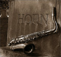
| 10/02/2006 07:43:23 PM |
Hornsby aberrationComment: This is a 10. No way around it. Nice tight crop without losing the (necessary) gravestone in the background. Desaturation is perfect. Composition is great. Three ideas: 1) Don't crop out the shadow of the sax at the first turn (under the mouthpiece)-it's kinda tight there. 2) Maybe throw just a little light into the business end of the sax to give it some shadow detail 3) Same for the gravestone in the background. Just a small amount of soft light to give it a little more standout detail. Don't know how those all would look, but it would be interesting to see the difference. Anyway, it's still a 10 in my book. Also an "added favorite". Thanks. |
| Photographer found comment helpful. |
Home -
Challenges -
Community -
League -
Photos -
Cameras -
Lenses -
Learn -
Help -
Terms of Use -
Privacy -
Top ^
DPChallenge, and website content and design, Copyright © 2001-2025 Challenging Technologies, LLC.
All digital photo copyrights belong to the photographers and may not be used without permission.
Current Server Time: 09/01/2025 10:04:30 PM EDT.