| Image |
Comment |
| 09/17/2005 03:34:45 AM |
Naturalby olimarComment: Looks like a perfume ad. I like how you've lit the background and model. The flower is a perfect addition. It looks just a tad out of focus in the further areas of the face; could use a greater DOF. 9+ |
 Photographer found comment helpful. Photographer found comment helpful. |
| 09/17/2005 03:29:05 AM |
|
| Photographer found comment helpful. |
| 09/17/2005 03:24:36 AM |
Veiledby labudsComment: Very reminiscent of the National Geographic photo. A decent job on the lighting and color choice to contrast the eyes. The light appears to be coming from left and right sides leaving a sort of darker area right down the middle of the face. But I am by no means knowledgeable in the art of studio lighting. You have done a great job here. |
| 09/17/2005 03:17:07 AM |
Those Eyesby mystical_princessComment: A decent photo to say the least but the touch-up work in the face makes it look a bit over-processed where the skin meets more detailed areas in the hair, eyebrows, and goatee. |
| Photographer found comment helpful. |
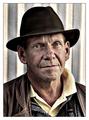
| 09/17/2005 03:11:34 AM |
Roninby NazgulComment: Wow! You did it. You captured "it". Perfect photograph in my eyes. The tones and contrast are just right. 10 |
| Photographer found comment helpful. |
| 09/17/2005 03:06:55 AM |
Girl in loveby birgirComment: I'm not feelin' the background so much. It's a bit "urban" for such a cute girl considering her attire. |
| Photographer found comment helpful. |
| 09/17/2005 03:03:34 AM |
Attitudeby shutterflyComment: Something about this makes it feel too artificial. I'm curious about the line that parallels her left cheak--shadow? Post processing artifact? Nonetheless, a very worthy photo. Good job. |
| Photographer found comment helpful. |
| 09/17/2005 02:57:31 AM |
Charmby magnusComment: Great photo! Depending on how much control you had over the lighting, the shadowing seems a little heavy on the right arm and side of the face. Good, clean focus and a nice expression on her face. I like the slight reflection of the light source on the face but I might consider making the background more consistent. Consider removing the bracelet. This is one of my favorites of the challenge. |
| Photographer found comment helpful. |
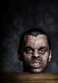
| 09/17/2005 02:52:09 AM |
Bite meby heidaComment: Friggin' awesome! I know, not a usefull comment, but love the photo. Great job all around; planning, execution, post prod. Good luck. 10 |
| Photographer found comment helpful. |
| 09/15/2005 07:21:27 PM |
The Disproportionate Nature of Apathyby myceliumComment: I get the apathy part but what is your title trying to say? The Golden Arches indeed represent some problem with the world, are you saying something about this? What is the message? |
| Photographer found comment helpful. |
Home -
Challenges -
Community -
League -
Photos -
Cameras -
Lenses -
Learn -
Help -
Terms of Use -
Privacy -
Top ^
DPChallenge, and website content and design, Copyright © 2001-2025 Challenging Technologies, LLC.
All digital photo copyrights belong to the photographers and may not be used without permission.
Current Server Time: 08/01/2025 06:37:34 PM EDT.