| Image |
Comment |
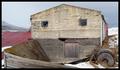
| 04/13/2005 01:05:51 PM |
Standing proudby lastefComment: I like how the building seems to have a "Wise Guy" face. The shadow makes a perfect nose. Almost as if it is saying "You talkin ta Me?" I like it! |
 Photographer found comment helpful. Photographer found comment helpful. |
| 04/13/2005 01:03:47 PM |
|
| Photographer found comment helpful. |
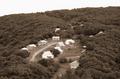
| 04/13/2005 12:59:09 PM |
Forest Ambushby SchuffComment: The desaturized colors don't work for me at all. The house looks purple on both of my monitors. If this had been submitted in natural colors, I think it would have done better. |
| Photographer found comment helpful. |
| 04/13/2005 12:54:32 PM |
|
| Photographer found comment helpful. |
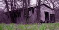
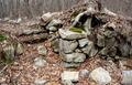
| 04/13/2005 12:51:30 PM |
Cellar Holeby BarryComment: Interesting shot. What exactly is a "Cellar Hole"? Is there a sealed up opening under the tree? I like the colors here. I wouldn't mind having this shot on my wall, but finding the building is a bit too much of a challenge for me. |
| Photographer found comment helpful. |
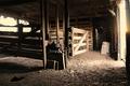
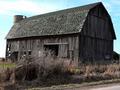
| 04/13/2005 12:48:27 PM |
If these walls could talkby sasharoseComment: I think I would have scored this a bit higher if the road was cropped off the bottom and there was more sky above it. The barn is interesting, but I think there should be some more space to the left of it in the photo. |
| Photographer found comment helpful. |
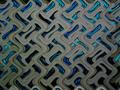
| 04/13/2005 12:41:02 PM |
Viramundoby Vanessa 72Comment: Very interesting shot. I like the textures and colors. Although this may be "abandoned" it doesn't appear so in this shot. Love the shot, just don't see the connection to Abandoned Buildings. |
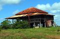
| 04/13/2005 12:36:49 PM |
Old Queensland Homesteadby BrianRComment: Photo is too small. Please try to make at least 640 pixels, otherwise scoring will be low. At this size focus looks blurred. Colors are nice. |
| Photographer found comment helpful. |
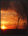
| 04/13/2005 01:20:33 AM |
The Alpha and the Omegaby rblantonComment: I gave the picture a 4. It needs more contrast, the picture looks "greyish". The clouds have a lot of noise in them. The focus is a bit soft, I can't tell what the point of focus was. I also found it hard to find the letters. I shouldn't have to rely on the title to figure out what I am looking for. Although the picture has a nice compositon, the quality of the photograph itself was lacking. Those are my observations. |
| Photographer found comment helpful. |
| 04/06/2005 12:04:24 PM |
Looking towards Heavenby 2ShayComment: Originally posted by jab119:
i feel the angle is a little too extream, good idea, but too much angle |
Thank you for your comment. I actually wanted to use an extreme angle in this shot. I was trying to portray the deceased's view of the sky. I liked the image and thought it would do better, but I guess it just didn't have enough interest to the masses.
Thanks again!
2Shay |
Home -
Challenges -
Community -
League -
Photos -
Cameras -
Lenses -
Learn -
Help -
Terms of Use -
Privacy -
Top ^
DPChallenge, and website content and design, Copyright © 2001-2025 Challenging Technologies, LLC.
All digital photo copyrights belong to the photographers and may not be used without permission.
Current Server Time: 08/05/2025 11:54:04 PM EDT.