| Image |
Comment |
| 05/21/2012 06:03:32 PM |
Take 2by MinsoPhotoComment: I think you did a great job with the people. The only strange thing I notice is the mirror of the letters. The S-T-U are almost straight up and down. The rest of the letters veer off more and more to the right. Because you have the lighting coming from both sides, this just 'feels wrong.' It seems to be at an angle, when you look at all the lettering together and yet by size, it doesn't. Not sure which was to go, but I don't think it sits well as it is. Otherwise, this is great work! |
 Photographer found comment helpful. Photographer found comment helpful. |
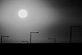
| 05/11/2012 11:36:57 AM |
Eat my dustby herfotomanComment: I love this. It is like an anti-landscape, a message, a simplification of the messy world into lines and shapes and tones. And there is something about it, simultaneously dark and amusing, that holds my attention even with the lack of detail (kinda like when a friend slips and falls and you don't want to laugh but you have to try really hard to suppress a giggle because you know it is inappropriate but you also know that, even in that dark sad moment, life's absurdity is presenting itself and you recognize it...). Anyway, I am reminded of those walking monstrosities in star wars and, at the same time, the Pixar lamp, and the movie, "Where have all the People Gone?" (which greatly influenced my childhood sensibilities). And so, in the end, I consider this a very successful image. Thanks! 10 and a fav. |
| Photographer found comment helpful. |
| 05/10/2012 07:14:45 PM |
Deadendby manabtawiComment: I'm really not a fan of the editing - I don't think it serves the image well. That aside, I think you found an excellent place to take this, and composed it very well. You made good use of what I can see of the natural lighting. |
| Photographer found comment helpful. |
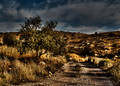
| 05/10/2012 07:13:15 PM |
Landscape with Nesting Swansby nickybComment: A difficult scene to work with. As a photographer, I would want to 'get down' so it doesn't appear that I am standing over the subjects but I would also be conscious of the back ground, which has a great amount of interest in and of itself. I think you did it well, considering the limitations you must have been working with. Something in the editing feels a little off though - I'm not sure. It feels like guassian blur was added. Whatever it is, it removes the naturalness of the scene (for me). At any rate, I find the image interesting. Thanks! 6 |
| Photographer found comment helpful. |
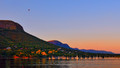
| 05/10/2012 07:08:29 PM |
Out thereby HarveyGComment: A pretty scene though I am overwhelmed by the hyper-saturation. |
| Photographer found comment helpful. |
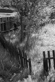
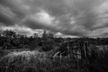
| 05/10/2012 07:07:40 PM |
Poorly Landscapedby jaysonmcComment: I'm not sure the black and white treatment serves this image well, though I really can't guess as to what color the grass or the fence may have been. The point of view is standard - I'm guessing an adult aiming slightly down. Maybe from a different point of view I would appreciate it more. |
| Photographer found comment helpful. |
| 05/10/2012 07:05:04 PM |
paintingby omikeoComment: I don't think the blur here helps the image - it just muddies up everything until you have solely mid-tones and no contract. The composition might be nice, but I really can't tell. |
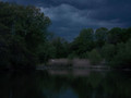
| 05/10/2012 07:03:55 PM |
Reaching for the Sunby BenstedComment: Pretty colors but really nothing of interest for me to grab onto. I think I would appreciate it more if it was just the sky. |
| Photographer found comment helpful. |
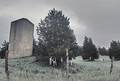
| 05/10/2012 07:02:55 PM |
shelterby posthumousComment: I think just a slight curves adjustment would help this image - it would allow a little more light into it. There is an awful lot of stuff here but, being that it is all reduced to tones (by virtue of it being black and white) it is hard to make out just what is what, to separate the parts of the image from each other. |
| Photographer found comment helpful. |
| 05/10/2012 07:00:43 PM |
Moo's nextby skewsmeComment: I'm not sure if this is intended to be black and white but I think color would be an asset to the image. |
| Photographer found comment helpful. |
Home -
Challenges -
Community -
League -
Photos -
Cameras -
Lenses -
Learn -
Help -
Terms of Use -
Privacy -
Top ^
DPChallenge, and website content and design, Copyright © 2001-2025 Challenging Technologies, LLC.
All digital photo copyrights belong to the photographers and may not be used without permission.
Current Server Time: 09/01/2025 07:52:38 AM EDT.