|
|
| Image |
Comment |
| 05/02/2005 04:11:36 PM | Solo Danceby purelandstudentComment: Thank for submitting your photo to the DPC, Free Study VIII.
Interesting capture here. There is one flower over to the left, while the larger group of flowers are diffused in the background.
I like your title. Titles are important because they give a point of information and reference. It tells the viewer, "this is what I am doing". By following the title, you can then see what you were going after. In this case, isolating one flower from the others. Leaving that one flower on the lower left creates a nice flow. Observers are going to see the one red flower and then see the background flowers.
Technically I like what you have done. It does appear that you have over done the BG blurr just a bit. I see the separation very easily, and the blur application almost makes it look like an "impressionistic" type painting. And that's not a bad thing. Did any one say "Bokeh"
Simple, elegant, and appealing. Good job.
Good luck in your next DPChallenge. |
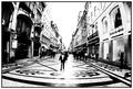
| 05/02/2005 03:59:41 PM | Downtownby DiscraftComment: Thank you for submiting your photo to the DPC, Free Study VIII.
Very interesting perspective and capture here. It shows a day in a life of a retail area. Full of people and stores all around. It is intriguing as well that everything seems to be in order. The way you photographed it, it appears that everything fell into place on cue. The way the man in front is position, and the rest of the objects and elements. The ground has an interesting display as well. Is this a paved street with painting on it?
Your use of black and white is perfect. Giving the image a feel and mood of time and space. The use of an "Fisheye" lens also helped capture the breath of the area. I am assuming its a "Fisheye" lens, because of the f 2.8 aperture opening. Wide angle lens also provide a distortion similar to "Fisheye" lens. I would also guess that a wide angle about 12-24 lens would have also capture the width of the area, as shown here.
Technically speaking, the same thing that makes this image appealing is the same thing that distracts from it. The white balance area's hide details of the photo. The horizon is a white wash eye point. The light that is coming from the background is also hiding the foreground area.
It is very artistic and will generate lots of interest, as long as people take the time to study your composition.
Good luck in your next DPChallenge. |  Photographer found comment helpful. Photographer found comment helpful. |
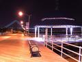
| 05/02/2005 02:10:17 PM | Along The Boardwalkby gtroiaComment: Thank you for submitting your photo to DPChallenge, Free Study VII.
Great capture of a empty boardwalk area on Staten Island, N.Y.
Where are the people? It must real cold and real late night. You have some terrific points of reference. The bridge in the background, which I believe is the Verranzano Bridge? The other reference point is the lamp post banner. Which proudly states "I love NYC".
Technically a few comments. The lamp posts lights are a bit overwhelming. As well as the lights in the round covered area to the right of the frame. Bringing or changing the exposure compensation to a lower level, might have given the scene a softer tone. I also like the blueish shine that the light source provides. Again a little less light, would given it more appeal. It tends to create a distraction, and dull the details in the image. It also appears a little unbalance from the foreground on back. Saving the camera settings would have been key to knowing what works as well. This would be valuable information if and when you would want to reshoot.
I know its a pain, but a tripod on a night settings always helps the situation. If a tripod is not available, try a standing flat object to shoot from. Another approach to consider is converting this image to a black and white photo. This would create a somber and artistic mood. One that would reflect the empty boardwalk, and the quiet of a NYC night.
Good job, and good luck on your next DPChallenge.
| | Photographer found comment helpful. |
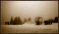
| 05/02/2005 01:04:24 PM | All That Is Left Is The Fading Photos, The Voices Of The Past Have Since Disappeared ...by JectoComment: Thank you for submitting your photo to DPC, Free Study VIII.
A great caputure of snow scene at a ski lodge. The sepia tone effect gives it old time retro feel. The surrounding mist provides it's own noise or grain to the image. It is very interesting how you decided to photograph it from a long distance. Giving it an almost private observer feel to it. The high crop to the top of the frame gives it a spatial comfort. It almost like you were you not really in the spot but just became one with the area.
It take some courage to post this image as some viewers will not relate to it. It is very well done. Very artistic, and you have to spend time looking at it, to make it work. I like the three different groups of people standing around. You can almost hear them talking. Their details are lost but that is not so important to the message of the photo.
I do have a comment about the title. It's is kind of cryptic and long. Sometimes we tend to relate the title and image to make a point of reference. With only seconds to view and vote on photos, most won't take the time to figure out the message. This would will ultimately take away from positive voting.
Great capture. Good luck in your next DPChallenge. | | Photographer found comment helpful. |
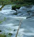
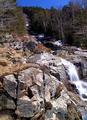
| 05/02/2005 12:34:08 PM | Mountain Streamby ace flymanComment: Thank you for submitting your photo to Free Study VII, DPChallenge.
A great landscape capture. A surreal almost feel to it. The color and tone have a great appeal.
You have selected to focus I assume, on the aspects of the water in this shot. However, the tree branch in the lower portion of the frame is a bit distracting. It takes the eye away from the main portion of the image. A closer crop would have helped the photo maintain its easy flow so to speak.
I like the long exposure technique. It makes the water puffy and soft. Giving it a dream like feel. I also like the different shades of color on the water. It has different shades of the same color, from light to dark. Too bad you didn't record the camera settings. It would help later on if you went back to the reshoot. I would assume that the shutter speed on this, has to be at least 1 second or more. I am guessing here. The surrounding landscape area appears a little blurred. So perhaps you didn't use a long exposure. The use of a tripod would have helped if you took it hand held.
Overall a great capture. Great colors, a different cropping would have given it more appeal.
Good luck in your next DPChallenge.
| | Photographer found comment helpful. |
| 05/02/2005 12:18:38 PM | 1951 GMCby eugeneComment: Thank you for submitting your photo to the DPChallenge, Free Study VII.
Good photo of a old American classic. The use of black and white conversion gives it a timeless classic style. The retro design of these old vehicles are priceless to possess. I am sure that this vehicle is one of your prize possessions.
Technically it works well. Your focus and lighting are good. Your cropping however leaves some questions. It would have been good to see the rest of the vehicle. It kind of leaves the viewer with wanting to see more of the image. There are minor distractions in the center of the photo. Its the reflection from up above. Its on the hood and right side fender. It takes away from the smooth and clean look of the shot. You might have had your reasons to only shoot half of the vehicle.
Overall a good clean shot of an old American car classic.
Good luck in your next DPChallenge.
| | Photographer found comment helpful. |
| 05/02/2005 02:18:33 AM | Greenfieldsby justinbrookComment: Thank you for submitting your photo to the Free Study VII DPChallenge.
A good capture of a outdoor area. It looks more like farm or rural setting. I see that you have focused on the green grass, thus the title. It also looks like this might be a wide angle shot, by the large perspective in the frame. The image also is about the area around the "Greenfields". You show great colors here. Blue skies, green grasses, trees and some brown structures I believe.
These type of open ended types of imagery, where there is no particular focal point does not always appeal to voters. There should be some strong interactive type of element to bring the viewer into the scene.
Although its a dreamy, and well composed shot, the viewer interest is lost. There is nothing to really relate to immediately.
Technically there is some oversaturation in the sky and grass area's.
You have to be careful using your image editor that you don't over do the color corrections. Sometimes especially skies, tend to pixelize from too much over color editing.
You could have cropped a little more of the sky off. It tends to overwhelm the lower portion of the frame. Another curious note is the camera settings that you show. You show a shutter speed of 1/1600. I wonder if this is the correct setting. Did you use a tripod? or was this handheld? A shutter speed that fast is needed for fast moving objects. So I wonder what your purpose was there. Just curious.
Overall a good effort.
Good luck in your future DPChallenges. | | Photographer found comment helpful. |
| 05/02/2005 01:56:09 AM | Contemplationby NatatorComment: Thank you for submitting your photo to the Free Study VIII, DPChallenge.
A very nice capture of an infant looking away from the camera. A very cooperative no less baby. She appears to be focusing on someone or someting on side of the camera. Hey, anything you have to do to take the shot. The title is very amusing as well. Like the baby is actually thinking something over.
I like the framing and the choice of the background color. I also can't tell if this is a table or the floor that you are using to take this photo. Well done there.
Technically there are some minor area's for improvement. The choice of B&W conversion was a good one. However, there are some harsh tones on the baby's left side. More of understated light source issue. A left side reflector might have help the situation. Also an additional fill light might have helped the mouth and chest area's.
In the absence of studio type lighting, this is an excellent capture that you should be proud of.
Good luck in your future DPChallenges. | | Photographer found comment helpful. |
| 05/02/2005 01:19:44 AM | Sky Captainby max90034Comment: Thank you for submitting your photo to the Free Study VII DPChallenge.
Excellent capture and composition. Capturing one of natures birds in flight is not easy. I am sure that you had been waiting for just the right moment to photograph this great water bird. The bird looks happy, healthy, and content with flying away, while give you a eyeful.
At first view its a pleasing shot. It does look a bit over done with USM. The color also looks a little over saturated. But none of these observations takes away from the awesome spectacle of this bird in flight. The colors in contrast with the birds brown color makes it very appealing. I had wish you had provided the camera shot settings. I image that is image was taken at a very fast shutter speed, probably about 1/400-500th of second. You had great outdoor light so most digital lens would have worked well.
Overall an amazing shot. I might have cropped less of the frame on the righ hand side, to show the direction of the birds flight.
Good luck in your future DPChallenges. | | Photographer found comment helpful. |
| 05/02/2005 01:01:32 AM | Spring Snowmeltby mfairbanksComment: Thank you for submitting your photo to the Free Study VII DPChallenge.
A good nature capture. It shows a clear blue sky, trees, and rocks.
I am not sure by looking at it where the focal point is. The bigger lower rocks seem to add to the confusion. You selected a beautiful location but there is a lot of image elements to view. If snow melt is the subject of your image, perhaps a closer zoom or crop would have work out better. You seem to have two objectives with the photo. One is the area where the snow melt is coming from, and the other is where the snow melt is going. I think cropping up a third way up from the bottom would have narrow the viewers eyes on the image.
I am not sure why you are not showing your camera settings, but they are vital to learning what works and what does not.
Another issue is the light source that is being used. It appears about early afternoon. This time of day produces a harsh light, especially on landscape photos. I would guess as well that this shot was a hand held shot. Most times landscapes shooting works better with a tripod. This would produce a sharper image, and provide more image detail. At this point the middle area of the photo looks blurred. Another possibility with this composition, is to move over to the center or the middle of this area and shoot from there.
Overall a good idea and composition.
Good luck in your future DPChallenges. |
Home -
Challenges -
Community -
League -
Photos -
Cameras -
Lenses -
Learn -
Help -
Terms of Use -
Privacy -
Top ^
DPChallenge, and website content and design, Copyright © 2001-2025 Challenging Technologies, LLC.
All digital photo copyrights belong to the photographers and may not be used without permission.
Current Server Time: 08/03/2025 10:08:36 PM EDT.
|