|
|
| Image |
Comment |
| 05/24/2005 12:48:57 AM | Sharp Steel Trianglesby howardjComment: Greetings from the Critique Club.
Good shot of the old New York Worlds Fair structure. It certainly looks about forty years old. Great photo angle, where you can see the geometric shapes of the structure. Actually there are many shapes visable here. Interesting use of iron cable wires to hold the structure together, something similar to the Brookly Bridge design.
Technically, its amazing that at 1600 ISO, you don't see much grain or noise in the image. The image loses some of it appeal due to its bland coloring. Perhaps at a different time of day, you could have gotten better lighting results. The background light is flat or dull. Sort of cloudy or overcast day when the shot was taken. That might explain the high ISO setting.
I am sure that most voters would have like this photo. It is probably different and unique take on the "Triangles" challenge. Although a lot structures use the triangle shape in their design, you just have to find the bridge or building that you need. I am sure that there are many different structures in NYC where you can see these geometrics.
Good imagination, good capture, great title. Work on the color presentation.
Good luck in your next DPChallenge. Zagman. |  Photographer found comment helpful. Photographer found comment helpful. |
| 05/24/2005 12:11:34 AM | How many triangles?by LKMoteComment: Greetings from the Critique Club.
Good capture of a bridge and airplane. The triangle is very easy to recognize but the plane is a bit out of range. This leaves the frame a bit disconnected. The idea is a good one, but there are several factors to look at. The distance between the bridge and airplane is far. This creates a distraction for the viewer. You can almost miss the airplane.
Your position for taking this photo is good. Right in the middle of the bridge and the airplane above. I wonder if you knew if and when the airplane was going to pass by.
Technically the image suffers from being blurry all around. This could be due no tripod photo taking, or too much compression during post processing. You must know the obvious about the tripod, so I will comment about the post processing. For the DPChallenge, try and come as close to the 150K limit as possible. Also try saving your photo file to special DPC folder. Don't optimize your file for the web, instead use the "save as" Then later check the file size again before uploading to the DPC site.
JPEG files tend to be weak pixel file format. Everytime you open, save or resize, its loses some more resolution.
You have a good DSLR, also try and shoot at the highest resolution possible. Check your user guide to customize and use the "parameters settings, they can boost some of your color, constrast and sharpness as well.
Good luck in your next DPChallenge. Zagman | | Photographer found comment helpful. |
| 05/22/2005 10:15:20 PM | Watching YOU watch HER...by eyesightphotoComment: Greetings from the Critique Club. Thank you for entering the DPChallenge, Outside Looking In.
Good capture of the women inside the room. She appears to be busy doing her toenails or dressing herself. This sort of fits into the voyuerism category. She watching you, you watching her, the viewer watching all.
You certainly are outside looking in. It looks like a dorm room, with the book in plain view. The mini blinds are open just right. There is enough of the women and the room to form an opinion.
The position of the camera is also very interesting. It appears to have been raised up. It stands in the middle of the frame, capturing the person outside and the subject inside.
Technically a good job accomplished. Good light source, focused, a long shutter used (2.5 seconds). You have both people freezing in place for the long exposure. There is an ominous shadow behind the woman. It almost looks like a shadow outline of a photographer. No matter, it does not distract from the photo. Pretty good for a last minute set up shot.
Good job, I am sure that it will appeal to the voters.
Good luck in your next DPChallenge, Zagman.
| | Photographer found comment helpful. |
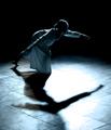
| 05/19/2005 09:26:20 PM | Dancing ballerinaby HokaheyComment: Hello from the Critique Club. Thank you for entering the DPChallenge, Dreams.
Great capture!! A ballerina taking center stage, and dancing in to a dream. Very elegant and sophisticated composition. It almost looks like she is posing for you. The lighting and framing creates a great mood. The shadows and silhouettes also add depth to your total image.
The upper background in black is a great idea. It separates the top half from the bottom half. It gives it a perfect color tonal balance.
The fact that this a "dream" shot gives the subject a bit of mystery and intrigue. I am sure that most people don't dream with all the details or they don't remember them as well. You don't need to see the dancers face to appreciate the imagery.
Even though its a dreamy photo of a dream sequence, there is still enough highlights and details to see and explore more of the dancer and her movements.
The large white spot lighting on the floor, distracts the viewer, but only in minor way. Actually, the white spot lighting also gives the photo lost reference point. In other words, its like another point where the dream or photo is taking the viewer.
Very well done. I am sure that this photo will be very popular with our voters.
Good luck in your next DPChallenge. Zagman. |
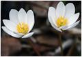
| 05/18/2005 02:13:19 AM | To be lovedby AlexysComment: Greetings from the Critique Club. Thank you for submitting your photo to the DPChallenge.
Great capture of a flower, and all of it's beauty. The slight turn of the flower to the right, makes it appear like it has wings, and that it will soon fly off. The white and yellow colors does provide a great contrast. The background tone is very well done. It gives the subject a good color balance. The focal point being the middle of the flower is sharp and colorful. The way that you overlapped the flower petals away from the frame, makes it appealing to the viewer.
Technically the photo is very good. There are some factors that could have made it more favorable. Some of the lower left petals needed sharpness. So a better depth of field (DOF) could have solved this blurriness. I am not sure what type of lens you used. But sometimes its better to pull back just a bit to get a wider more sharp focus. Then when you post process you can zoom and recrop the shot closer. You would need to shoot in Raw or highest JPG format so the image pixels won't get grainy or pixelated. Another factor when submitting photos to the challenges, is to get as close as possible to the 150KB limit, as possible.
Overall great job in photographing this flower for the challenge. It's simple and elegant. The colors not too over done. A good intrepretation of the challenge. I like the borders. Again, this gives it another color appeal to the total photo framing.
Good luck in your next challenge. Zagman.
|
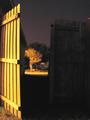
| 05/17/2005 12:15:31 AM | Gateway to the Nightby dahvedComment: Hello from the Critique Club. Thank you for submitting your photo to the DPChallenge, Late Night.
Looks like a private view of the house across the street. The door is opened just enough to see the street and the house. The light on the tree looks well placed. It could be a street light. The same type of lighting is on the fence on your side as well. I suppose you can go through this doorway and steal into the night.
This is an interesting choice, but it has several factors for discussion. The viewer is not really engaged into the photo. There is no focal point, except the objects on the other side of the street. You can see sky, but its almost secondary. The shot is almost at an angle. It could be the unbalance look of the wooden door. There is a lot of grain in the sky making it distracting.
Technically, I see that you used a long exposure. 15 seconds on a aperture of f/3.2 and the camera was on automatic. Yeah, as you mentioned, you could have used different ISO settings to give the scene for interest. A higher ISO setting has to be matched with the correct light and shutter opening. If your camera has manual settings, this could also help find the correct exposure.
The light from your back yard patio, might work if you had experimented with different light and camera setting combinations.
You have met the challenge but your image does not engage your viewer. The color combinations are very interesting. The dark and light yellow colors make it a photo with potential.
Overall a good simple shot that some voters might like.
Good luck in your next DPChallenge.
| | Photographer found comment helpful. |
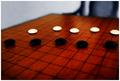
| 05/14/2005 10:14:32 PM | five on five, on goby ergoComment: Greetings from the Critique Club. Thank you for entering the "Five", DPChallenge.
Very interesting choice for the challenge. A board game sort with checker looking objects. Can't say I am familiar with the game. Well you certainly met the challenge for "Five". You have five pieces on either side of the board. So you are actually looking at 5 + 5 = 10.
The composition and idea is a good one. Show five objects on a board. The diagonal display is a good option to show your photo.
Technically the image needs a better depth of field. The unfocus or blurry area's distract from the message of the photo. Again I am not sure how and why you placed the objects on the board in that order. It doesn't really matter, the point is that some of the objects especially the white ones need more detail and highlight. The white ones almost seem to glow from the ambiant lighting used. I see that you used a lens with f/2.8 aperture opening. It should have given you a better DOF.
Sometimes a hand held shot in lower light, turns in blurry. Try experimenting with different shot angels for better lighting.
The cropping used is good. However, a little tight on the right hand side. It appears to cut off some part of the white game piece.
Good idea's. A strategy/warfare board game sounds like a it may have had photo potential. Watch the lighting and focus.
Good luck in your next challenge.
| | Photographer found comment helpful. |
| 05/12/2005 09:14:56 PM | A Brother's Loveby SnapperLComment: Greeting from the Critique Club. Thank your for entering your photo to the DPChallenge, Moods.
A good portrait shot of two siblings. They appear happy, healthy and show a great relationship bond between the two. It looks like brother is really showing his affection for his sister. The physical similarities are striking. They both have the same eyes. It looks like a great candid moment, not staged prior, which gives it more appeal.
I am guessing that this was shot outdoors. The natural light hitting the subjects make some parts of the frame a bit light. The afternoon shadows on the faces also hide some detail highlights. Fortunatley, the shadows and highlights were spread over the subjects well. The background is very wash out. It almost has no point of reference as to where they are.
Technically giving this image a black and white conversion, makes it a classic family type photo. The tight crop on the boys head, works well. Also the slight lean of the girl on the boy is very sweet.
I am sure that this photo will be very popular with our voters.
Good luck in your next DPChallenge. | | Photographer found comment helpful. |
| 05/12/2005 02:35:55 AM | An Incandescent Worldby madhatterComment: Greeting from the Critique Club. Thank you for entering the Moods, DPChallenge.
Great capture of the beautiful sunset. There are many shades of brown and yellow. The lines on the beach are very striking. The big rock looks like some type of "monolith" or structure. The shadows or reflections from the big rock is very appealing. I guess the actual sun is behind the big rock. This is probably a great position to take this shot. Sometimes sunsets are difficult to frame and compose. The sun shining in the center of the frame actually blocks your view.
Again great shot of the sunset and your buddy's shadow in the foreground.
Technically this is a well done shot. You can't really go wrong on sunsets. Much of the shot is getting the sun and the other elements in the frame. The factor here is trying to figure out the "mood" of the shot. I am not sure how you are relating this image to a mood. It does communicate a sense of calm, and serene. But with your buddy in the center I wonder what the message is. He looks more like he is trying to get out of the shot.
By the way great title "Incandescent World". "Let there be light". This photo would have been a great image for shadows, and or silhouettes.
Great colors and composition. You will probably get a mix reaction on this entry.
Good luck in your next DPChallenge. | | Photographer found comment helpful. |
| 05/11/2005 02:54:55 PM | Joyby nfesselComment: Greetings from the Critique Club.
Thank you for entering the Moods, DPChallenge.
This is a fine capture of two flowers in the Moods challenge. The white and yellow coloring does generate a mood disposition. The systemetrical distance also creates a viewer appeal. The soft lighting adds to the mood or emotion that your are trying to present. Flowers are good choices for mood or evoking feelings. Flowers are also symbols in most parts through out the world. Their presence creates calm, or asethetic beauty to a room or enviroment.
Technically the composition is well done. The balance or centering of the elements are good. The water drops, and am not sure if they are drops, make this image very appealing. It would have been better if the flower stems were in focus. This would add a total and complete feel to your image. Its almost like the two flower "heads" are communicating without their bodies.
There are area's where better lighting could have help your photo. Its a little soft on the flower on the left side of the frame. The highlights and details are missing. The water drops look more like stains. The flower on the right hand side of the frame looks better focused. Overall the white contrast area's seem to blur the focal point of your photo. It almost competes with the blurred background, causing some viewer distraction.
Since you did not include your camera settings, it is difficult to ascertain what other options you could have on this shot. I am guessing that you also took this shot at a wider angle and cropped and resized for the challenge. Make sure that when you optimize for the web and this challenge that you stay as close as you can to the 150K file limit. This will produce the resolution and sharpness needed to satisfy even your toughess critics.
Overall a good shot, a little soft on the right side of the frame. A great submission to the challenge. Many voters will like the interpretation and others will not see the appeal.
Good luck on your next DPChallenge. Zagman.
|
Home -
Challenges -
Community -
League -
Photos -
Cameras -
Lenses -
Learn -
Help -
Terms of Use -
Privacy -
Top ^
DPChallenge, and website content and design, Copyright © 2001-2025 Challenging Technologies, LLC.
All digital photo copyrights belong to the photographers and may not be used without permission.
Current Server Time: 08/02/2025 10:53:02 PM EDT.
|