| Image |
Comment |
| 04/16/2005 02:43:34 AM |
|
 Photographer found comment helpful. Photographer found comment helpful. |
| 04/16/2005 02:38:57 AM |
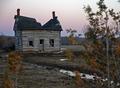
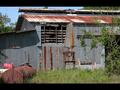
Abandonedby Dim7Comment: something weird - no matter how long I look at this, it seems to look like a childs toy, or maybe a trainset mock-up. I'm sure it's not, but I can't get the thought out of my head. Weird. Good image - 8 |
| Photographer found comment helpful. |
| 04/14/2005 11:35:28 PM |
|
| 04/14/2005 11:35:06 PM |
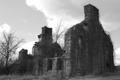
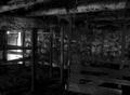
Timeby BotikaComment: the focus spot seems to be the bendle of vines in the very front of the image. I think it would have improved the image to either focus on the windows, or increase the Dof. I also find the thngs on the ground (not sure what they are) distract the eye away from the windows. |
| 04/14/2005 11:32:40 PM |
|
| 04/14/2005 11:31:37 PM |
|
| Photographer found comment helpful. |
| 04/14/2005 11:30:19 PM |
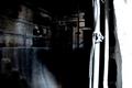
...here he kept her very well.by the-O-sterComment: I had to look hard to figure this one out. I think it could have been improved by a bit more DoF, or perhaps moving the focus more to the person, and maybe cropping a bit more of the white (or even just toning it down a notch), which I find grabs your eye and draws it out the right side of the image. That's why I missed the person until I looked the second time. |
| 04/14/2005 11:26:26 PM |
|
| Photographer found comment helpful. |
| 04/14/2005 11:25:51 PM |
|
| 04/14/2005 11:24:52 PM |
Boarded Upby KarasuComment: I think this crop is not the best. You've cut off half the boards of your title, and the focus seems lost. My eye is drawn up and out of the image by the for sale sign. The green fence and railing look interesting, too, so they may have added to the image if you'd included more of them. |
Home -
Challenges -
Community -
League -
Photos -
Cameras -
Lenses -
Learn -
Help -
Terms of Use -
Privacy -
Top ^
DPChallenge, and website content and design, Copyright © 2001-2025 Challenging Technologies, LLC.
All digital photo copyrights belong to the photographers and may not be used without permission.
Current Server Time: 08/27/2025 06:37:24 PM EDT.