| Image |
Comment |
| 06/20/2005 07:47:39 AM |
|
 Photographer found comment helpful. Photographer found comment helpful. |
| 06/15/2005 07:56:23 AM |
|
| Photographer found comment helpful. |
| 06/15/2005 07:55:10 AM |
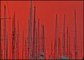
Fighting Daylightby ttibbyComment: Not sure the border adds to the image. Perhaps it would have been better in black - which mich have helped balance the more gray feel in the image itself. Very good take on the challange, though. 5 |
| Photographer found comment helpful. |
| 06/08/2005 01:36:09 AM |
The Last Decisionby ShamanComment: Thanks everyone for the votes - this is my first top ten, and my first over 6.0 ranking. I've learned a lot here, and look forward to learning a lot more from all you great folks. |
| 04/28/2005 02:28:38 PM |
Picture 021.jpgby No1_Dogman_2004Comment: This is OK - I find the colours a bit flat. The large area not in focus is a bit distracting - it may not be pssible, but if you could get the whole thing in focus with a deeper DoF, I think that would improve the image. Or, perhaps just crop away some (1/3 or so) of the left side, to remove a good percentage of the out of focus area. |
| 04/28/2005 02:25:58 PM |
Picture 020.jpgby No1_Dogman_2004Comment: I like this a lot - the cards reflecting in the drops are good. Did you do it in colour - the color of cards in the reflections would be even more interesting, I think. |
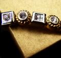
| 04/25/2005 09:28:46 AM |
From the Gold Boxby loveComment: focus seems to be more on the tip of the table? in the foreground, and not on the gems. |
| Photographer found comment helpful. |
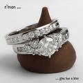
| 04/25/2005 09:27:42 AM |
a diamond is forever by hopperComment: nice image - great focus. IMO, a bit more light on the diamonds would have helped, and perhaps given them the bit of sparkle they lack, and there is some slight haloing around some the edges - eg the very tip of the the kiss and the bottom left and mid right of the kiss as well. Otherwise, great job. - 8 |
| Photographer found comment helpful. |
| 04/25/2005 09:24:04 AM |
|
| Photographer found comment helpful. |
| 04/25/2005 09:22:51 AM |
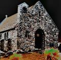
Irrisistable.by tasha4pawsComment: great lighting. Nice shine on the gems. I'd have perhaps cropped the top just slightly lower, 1/3 inch more or so, to really put the focus on the necklace. |
Home -
Challenges -
Community -
League -
Photos -
Cameras -
Lenses -
Learn -
Help -
Terms of Use -
Privacy -
Top ^
DPChallenge, and website content and design, Copyright © 2001-2025 Challenging Technologies, LLC.
All digital photo copyrights belong to the photographers and may not be used without permission.
Current Server Time: 08/28/2025 04:45:51 AM EDT.