| Image |
Comment |
| 03/05/2005 01:41:09 PM |
A shellby hjolliComment: I like the lighting...how it seems to shine through the shell. My only problem with this photo is where you positioned the shell. Since it opens up to the left, it feels abruptly cut off by the left edge. If is sat on the right side, it's line would flow better into the frame and we could enjoy it more. |
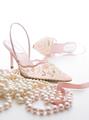
| 03/05/2005 01:37:31 PM |
Stepping Outby animes2kComment: Nice lighting and luminescence on the pearls which are in nice contrast to the matted fabric surface of the shoes - great shoes, by the way! :) I like the line of the ribbon, pearls and front shoe. I think I would take away the shoe in the background because it breaks the curvy flow. |
 Photographer found comment helpful. Photographer found comment helpful. |
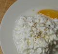
| 03/05/2005 01:32:06 PM |
Cottage Cheese Plateby cornettcagComment: Nice lighting and highlights on your cottage cheese, but the background is disappointing because you can see non-white wood colors in two corners. |
| Photographer found comment helpful. |
| 03/05/2005 01:23:42 PM |
|
| Photographer found comment helpful. |
| 03/05/2005 01:20:46 PM |
In a country churchyardby fredandaudComment: This picture has great potential, but there is quite a bit to look at. The headstones and fence are the most interesting parts, I think changing the perspective and zooming in more on them would be helful. |
| 03/05/2005 01:17:57 PM |
virginal blossomby jmleliiComment: I like the monocrhromatic look, and I like the sharp stamen agaisnt the softer part of the flower, but somehow the picture went a little flat. I think it needs more light. |
| Photographer found comment helpful. |
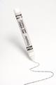
| 03/05/2005 12:09:10 PM |
Crayon Malfunctionby ralphComment: Intriguing photo. Don't know how you made the crayon look like it's standing up on it's own, but you did good. Also like that the white crayon made a dark line. Lastly, nice composition and line. Like the simplicity of it. |
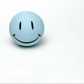
| 03/05/2005 12:06:43 PM |
smile when you're blueby hopperComment: I like the simpleness, but for me there's a lttle too much stark white. I think it would be better if you'd cropped it so that the ball took up more space. |
| Photographer found comment helpful. |
| 03/05/2005 12:02:43 PM |
|
| Photographer found comment helpful. |
| 03/05/2005 11:59:43 AM |
Paper Lightby DigichromeComment: Great theme photo, and nice composition. Only problem I have is that since pencil is prominent, I think it needs to be sharper. Nice idea and execution. |
Home -
Challenges -
Community -
League -
Photos -
Cameras -
Lenses -
Learn -
Help -
Terms of Use -
Privacy -
Top ^
DPChallenge, and website content and design, Copyright © 2001-2025 Challenging Technologies, LLC.
All digital photo copyrights belong to the photographers and may not be used without permission.
Current Server Time: 08/25/2025 04:37:51 AM EDT.