| Image |
Comment |
| 04/26/2006 07:07:26 AM |
|
 Photographer found comment helpful. Photographer found comment helpful. |
| 04/26/2006 07:05:20 AM |
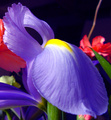
Irisby charliebakerComment: wow, a double - red/green in the background, purple/yellow in the foreground. You did a good job bringing one to the "starring role", but the extra vine at top and bud at bottom, etc take away a bit. 7 |
| Photographer found comment helpful. |
| 04/26/2006 07:02:17 AM |
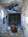
Fallen.by BrookeComment: I'm not seeing complementary colors here (appears as blue and brown) |
| 04/26/2006 06:59:57 AM |
Irisby smccComment: Maybe too many elements - deemphasizes the main flower. But, you sure got the colors spot on! 7 |
| Photographer found comment helpful. |
| 04/26/2006 06:58:13 AM |
|
| Photographer found comment helpful. |
| 04/26/2006 06:57:27 AM |
Passionby M.O.C.Comment: Parts of the stem are a bit blown, but it's a beautiful image. 8 |
| Photographer found comment helpful. |
| 04/26/2006 06:55:43 AM |
Kalaidoscopeby kiwinickComment: If only the goblet hadn't disappeared unevenly into the background - emphasizes a little too much over-processing. Concept is terrific. 7 |
| Photographer found comment helpful. |
| 04/26/2006 06:53:38 AM |
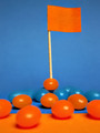
Victory !by ReM_FrComment: Letter and spirit - good one! (maybe a teeny bit more clarity - a little (!) noisy, with hot spots.) |
| Photographer found comment helpful. |
| 04/26/2006 06:51:25 AM |
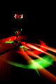
Taking the Turnby admart01Comment: Needs more contrast (curves?) to deepen the reds (which might make the numbers look more green - right now, they appear as a light blue.) |
| Photographer found comment helpful. |
| 04/26/2006 06:49:21 AM |
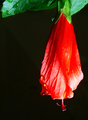
Hibiscus rosasinensisby DAWARComment: would like to have seen more green as part of the comp. reds seem blown at the bottom of the blossom. |
Home -
Challenges -
Community -
League -
Photos -
Cameras -
Lenses -
Learn -
Help -
Terms of Use -
Privacy -
Top ^
DPChallenge, and website content and design, Copyright © 2001-2025 Challenging Technologies, LLC.
All digital photo copyrights belong to the photographers and may not be used without permission.
Current Server Time: 08/26/2025 06:21:37 AM EDT.