| Image |
Comment |
| 02/21/2005 12:11:22 PM |
|
| 02/21/2005 12:09:20 PM |
|
 Photographer found comment helpful. Photographer found comment helpful. |
| 02/21/2005 12:06:50 PM |
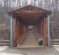
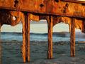
Foss Bridgeby mdelaplaneComment: Angles, colors, lines, patterns, and shadows. Nice, pleasant combination. |
| 02/21/2005 12:03:44 PM |
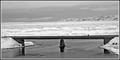
Honey...is it cold down there???by DogAngelComment: Amazing the things photographers get their loved ones to do! Needs a little straightening, but really nice composition (no pockets of distracting spaces between any of the elements.) |
| Photographer found comment helpful. |
| 02/21/2005 12:01:11 PM |
back bridgeby rsudaComment: One person or two. From title - it is probably one, but composition doesn't make it clear. |
| 02/21/2005 11:57:50 AM |
|
| Photographer found comment helpful. |
| 02/21/2005 11:57:11 AM |
|
| Photographer found comment helpful. |
| 02/21/2005 11:53:30 AM |
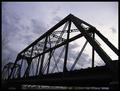
Sky is the Limit: Bridgesby supradaComment: Cropping the bottom area out would have added more stark impact. Also, it would have presented a more dramatic angle. As it stands, it lessens the conflict of Bridge against Sky. |
| Photographer found comment helpful. |
| 02/21/2005 11:50:20 AM |
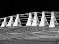
Pentabridgeby siquisComment: Too well centered, and a bit of a tilt? But, what a pattern! |
| Photographer found comment helpful. |
| 02/21/2005 11:47:55 AM |
Rustic decayby SpidermancrdComment: Oh, my gosh - that rusty structure is a feast for the eyes. Just a couple area distract from it, though: opposite shore leaving pockets under the bridge arcs, & the yellow triangle at upper right. |
Home -
Challenges -
Community -
League -
Photos -
Cameras -
Lenses -
Learn -
Help -
Terms of Use -
Privacy -
Top ^
DPChallenge, and website content and design, Copyright © 2001-2025 Challenging Technologies, LLC.
All digital photo copyrights belong to the photographers and may not be used without permission.
Current Server Time: 08/23/2025 06:16:23 AM EDT.