| Image |
Comment |
| 04/26/2005 06:23:58 PM |
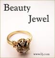
Beauty Jewel...by sfarrell23Comment: Great comp. I prefer a deeper DOF and maybe a different angle on the ring. The text seems to have pixel problem. Your have to add it after you save for web. |
 Photographer found comment helpful. Photographer found comment helpful. |
| 04/26/2005 06:19:50 PM |
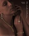
The Links Collectionby EddyGComment: This is the type of layout I look for! Creative and refined. The pieces really stand out as does the font! I only would recommend a larger font Up top and that the photo be from a different angle to avoid the overlapping earring and necklace. The bottom text is what we refer to as "a call to action" and is not in many of the entries. Outstanding work. |
| Photographer found comment helpful. |
| 04/26/2005 05:59:05 PM |
MAMBAby aznymComment: The font, comp, and piece are outstanding. The font needs to be a different color as I can barely see the text. The piece should be larger and be the feature of the ad. Very nice, |
| Photographer found comment helpful. |
| 04/26/2005 05:55:31 PM |
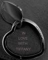
Tiffany&Co.by vivienComment: Great crop and Idea! Nice comp, needs more contrast to show the brilliance of the piece. I'd change the funny font with pixel problems |
| Photographer found comment helpful. |
| 04/26/2005 05:53:06 PM |
We take trade-ins....by ralphComment: Too funny, I sense a bitter, bitter person. I think this would be a great theme for a divorce Attorney. very crisp and well put together. |
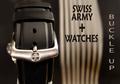
| 04/26/2005 05:51:18 PM |
Swiss Army Watchesby TommyMoe21Comment: Great comp. very, very crisp! but where's the watch? I like the idea but I'm not sure what you're selling here. |
| Photographer found comment helpful. |
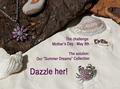
| 04/26/2005 05:49:31 PM |
Summer Dreamsby BeetleComment: great colors and very crisp. great tag lines but the comp is lacking. My eyes have to work to take in the ad. Remember " Less is more" |
| Photographer found comment helpful. |
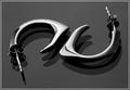
| 04/26/2005 05:46:23 PM |
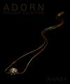
Dali's Earringsby labudsComment: This photo has so much potential. the shapes and shadows would allow me incredible creativity in wording my ad. A little more contrast to show the earrings color would be my suggestion. But in all, outstanding. |
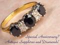
| 04/26/2005 05:43:18 PM |
Sapphires and Diamondsby hughletherenComment: really well put together, I like how you used the ring to shape the text. The background color needs (something that shows more contrast) to be different for the ad to really stand out. A little more focus on the back side of the ring would make this a stunning ad. You're on the right track. |
| Photographer found comment helpful. |
| 04/26/2005 03:15:22 PM |
Diamond Wedding Ringby -crtComment: Nice comp and photo, I'd change the font to something less complicated. Overall very nice. Nice text placement. |
Home -
Challenges -
Community -
League -
Photos -
Cameras -
Lenses -
Learn -
Help -
Terms of Use -
Privacy -
Top ^
DPChallenge, and website content and design, Copyright © 2001-2025 Challenging Technologies, LLC.
All digital photo copyrights belong to the photographers and may not be used without permission.
Current Server Time: 08/10/2025 04:04:53 PM EDT.