| Image |
Comment |
| 04/26/2005 06:52:35 PM |
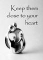
Keep them close to your heartby dsa157Comment: This is a nicely presented ad. Nice comp and font. However I don't get that this an ad for jewelry, maybe family values or religion. |
 Photographer found comment helpful. Photographer found comment helpful. |
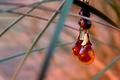
| 04/26/2005 06:50:40 PM |
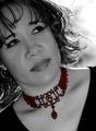
Highlighting Beautyby Travis99Comment: The desat makes the Piece stand out nicely, but I'd like the jewelry to a stronger feature of the ad (I.E. larger, more detailed. |
| Photographer found comment helpful. |
| 04/26/2005 06:49:02 PM |
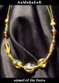
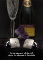
Amberby DustDevilComment: The comp is great and you chose excellent fonts to make the ad. A different backdrop with less reflection would make this a viable professional ad. |
| Photographer found comment helpful. |
| 04/26/2005 06:46:54 PM |
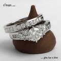
a diamond is forever by hopperComment: I really like the idea here, its very original and crisp.(Incredible photo!) Presentation of the rings is from a great angle. But, the text needs different palcement and a different font. Maybe a larger size too. But this is one of the best in the comp! (my Opinion with the usual disclaimers) |
| Photographer found comment helpful. |
| 04/26/2005 06:43:27 PM |
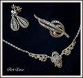
New "old fashioned" collectionby rhipsterComment: Nice, nice presentation, great comp and I like the texture of the background. Text is well defined and stands out. great comp. This ad is what I imagine when I think of Jewelry ads. Nice job! If I had to be picky, I'd ask for more contrast or saturation to get rid of the lint (only a slight distraction) |
| 04/26/2005 06:37:08 PM |
niagaraby vivienComment: From the Maids of the Mist? What a nice shot of one my favorite places! |
| Photographer found comment helpful. |
| 04/26/2005 06:34:47 PM |
Diamond Cuff Linksby cajayComment: Great, great job! I like everything about this ad. The tag line is clever and original. the product is clear, I understand what your selling and you build an image. Incredible use of DOF in a way I haven't seen in this comp so far.... I couldn't ask for more except the text needs to be capitalized and perhaps a different but definitely larger Font. |
| Photographer found comment helpful. |
| 04/26/2005 06:30:44 PM |
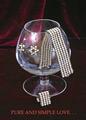
PURE PEARLSby mkirdalComment: I love the comp and what you're trying to do here. However the reflection in the glass is a big distraction to an otherwise near perfect ad. |
| Photographer found comment helpful. |
| 04/26/2005 06:28:28 PM |
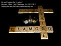
The Gameby mpembertonComment: Great concept! I don't know if I understand it completely. The lighting is a little off and I think your tag lines would work better on radio or TV. Believe me: This is a big complement! Nice comp with the photo but the text needs different placement , possibly font. |
| Photographer found comment helpful. |
| 04/26/2005 06:25:11 PM |
|
| Photographer found comment helpful. |
Home -
Challenges -
Community -
League -
Photos -
Cameras -
Lenses -
Learn -
Help -
Terms of Use -
Privacy -
Top ^
DPChallenge, and website content and design, Copyright © 2001-2025 Challenging Technologies, LLC.
All digital photo copyrights belong to the photographers and may not be used without permission.
Current Server Time: 08/10/2025 04:04:34 PM EDT.