| Image |
Comment |
| 06/08/2006 12:16:57 PM |
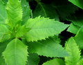
Leavesby skasubaComment: I like the depth provided by the photo. I'd like to see it a bit sharper, however. |
 Photographer found comment helpful. Photographer found comment helpful. |
| 06/08/2006 12:16:05 PM |
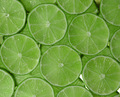
Lime Greenby behindthescenesComment: Great comp and lighting. Could use a levels/saturation adjustment to make this jump out at me. |
| Photographer found comment helpful. |
| 06/08/2006 12:04:44 PM |
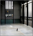
The Photographerby redmoonComment: A little sharper and this great example of minimalism could be a contender. Good Luck! |
| Photographer found comment helpful. |
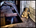
| 06/08/2006 12:00:31 PM |
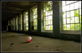
abandonmentby sysopComment: I like the contrast that the beachball gives it. Both in contrast and in subject. The angle gives the photo some depth that I like very much. |
| Photographer found comment helpful. |
| 06/08/2006 11:55:40 AM |
Left Behindby xXxscarletxXxComment: I like the grunge look. It fits the theme well. Seems like there are focus issues. and a little bit of oversharpening. |
| Photographer found comment helpful. |
| 06/08/2006 11:53:42 AM |
|
| Photographer found comment helpful. |
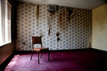
| 06/08/2006 11:51:35 AM |
Breezeby AnastasiaComment: Nice perspective and excellent lighting. I wonder how the theme police are treating you. |
| Photographer found comment helpful. |
| 06/08/2006 11:48:10 AM |
|
| Photographer found comment helpful. |
| 06/08/2006 11:46:28 AM |
the white roomby TrollManComment: I like the geometrical aspect of this photo. The wood contrasts the white very well. It does seem a bit uneven to me perspective wise. |
| Photographer found comment helpful. |
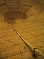
| 06/08/2006 11:42:19 AM |
Only one way out- UP!by dabidejpnComment: Different, I really like the perspective and angles and the leading lines. However, IMO it needs a levels or contrast adj to make it jump out more. |
| Photographer found comment helpful. |
Home -
Challenges -
Community -
League -
Photos -
Cameras -
Lenses -
Learn -
Help -
Terms of Use -
Privacy -
Top ^
DPChallenge, and website content and design, Copyright © 2001-2025 Challenging Technologies, LLC.
All digital photo copyrights belong to the photographers and may not be used without permission.
Current Server Time: 08/27/2025 10:42:27 AM EDT.