| Image |
Comment |
| 03/02/2005 11:11:49 AM |
|
| 03/02/2005 11:10:49 AM |
Balls!by Steve___Comment: I assume the focus was set to capture the thin circles of light reflecting from the right edge of the gulf ball. And the consequence of the decision was that the circles facing us would be a bit blurry. This was the right choice, yet I would have liked just a little more sharpness throughout. It also looks like it was a conscious choice to wash out the texture of the ball on the left side. Somehow this choice makes the photo seem a little out of balance - as if the right side should have been cropped more tightly. Still it seems to be a powerful shot. |
 Photographer found comment helpful. Photographer found comment helpful. |
| 03/02/2005 11:06:30 AM |
|
| Photographer found comment helpful. |
| 03/02/2005 11:05:43 AM |
Mr Bubblesby whatdewucComment: The photo would benefit from a scrubbing. While the warm tones work for the model, they make the bubbly suds look much too yellow. This causes the subject to dissolve away into the background. |
| Photographer found comment helpful. |
| 03/02/2005 10:57:54 AM |
|
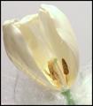
| 03/02/2005 10:54:14 AM |
Divaby rblantonComment: Deconstructing the Tulip. It seems to me that the highlights are blown, but I love the milky color against the cold white of the background. |
| Photographer found comment helpful. |
| 03/02/2005 10:51:53 AM |
snow gullsby byoungComment: I imagine the light was really warm, but I think the photo would be improved if the whites were less yellow. I realize that one does not just line up three seagulls and shoot them from whichever angle one chooses, arranging the lighting direction to suit the purpose, but I found the arrangement to be a little static. |
| Photographer found comment helpful. |
| 03/02/2005 10:45:39 AM |
Diaphanous Visionby awpollardComment: As a rule I really dislike photos that lack contrast, but this photo really is inspired. The light and shadow are perfectly controlled and the line is beautiful and elegant. I'm not sure this would tranfer well into a big poster, but it is a pleasing little gem. |
| Photographer found comment helpful. |
| 03/02/2005 10:41:03 AM |
frangipani trioby clare71Comment: At last, a flower that is not over-photographed. And the arrangement is inspired. Even anticipating that the challenge would be full of mums, roses, and other flowers I did not anticipate these beauties. Very Nice. |
| 03/02/2005 10:37:14 AM |
Be mindful of over-exposing your highlights!by the-O-sterComment: In this case "Be sure you do over expose your highlights." It's an interesting shot. I like how unconventional use of light can transform a solid and boring industrial space into an ethereal one. But in the end, the space still wins, and it is an ugly space. |
Home -
Challenges -
Community -
League -
Photos -
Cameras -
Lenses -
Learn -
Help -
Terms of Use -
Privacy -
Top ^
DPChallenge, and website content and design, Copyright © 2001-2025 Challenging Technologies, LLC.
All digital photo copyrights belong to the photographers and may not be used without permission.
Current Server Time: 08/06/2025 04:40:49 AM EDT.