| Image |
Comment |
| 04/15/2005 01:57:13 PM |
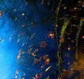
rootsby messerschmittComment: Beautiful and inspiring. It's reassuring to see someone else looking at water this way. |
 Photographer found comment helpful. Photographer found comment helpful. |
| 04/14/2005 08:12:03 PM |
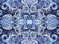
Black Beautyby AlbireoComment: The lighting is exquisite, the color and texture beautiful, the framing inspired. Very nice shot. |
| Photographer found comment helpful. |
| 04/14/2005 08:04:52 PM |
|
| 04/14/2005 06:54:33 PM |
cigar.jpgby grigrigirlComment: 'Sometimes a cigar is just a cigar.' - Freud
This isn't one of them.
Sorry don't know what got into me, just came from reading a thread on cliches.
|
| Photographer found comment helpful. |
| 04/14/2005 06:42:12 PM |
Watch Your Stepby jpetersComment: Nicely observed. I love the texture & color. Nice choice in getting close & low and looking up - it exaggerates the vertical distance. |
| Photographer found comment helpful. |
| 04/14/2005 06:39:56 PM |
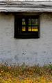
Chicken Coopby avbowlerComment: Beautiful, jewel-like, inspiring.
Perhaps I am overimressed with genius in simplicity, but be that as it may, I love this photo for its simplicity. I like the textures of the wall, the grass, the wildflower, and the musty stuff growing on the wall. But what drew me to the photo was the sunlit patch of wildflowers framed by the dark wooden window.
This is the slightest quibble, but I would have cropped out the sky. In fact, I think the photo looks fine with only the merest hint of roof.
|
| 04/14/2005 06:34:41 PM |
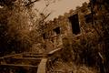
The king no longer abidesby fstopopenComment: A stone house with crenellations! Cool. I like the subject. I like the curved path leading to the door. and the diagonal line of the roof through the photo. I'm afraid what I am having a great difficulty with is the exporure and the final effect. The 'mostly desaturated and with no value greater than mid gray' look just looks too oppressive. I think the strong shadows in the doors are dark enough to give a dark look to the photo even if the sky were virtually white and there were no shadows elsewhere. I also thing this treatment doesn't let us see the texture in the stonework or the brush. |
| Photographer found comment helpful. |
| 04/14/2005 06:25:58 PM |
Brick & Treeby napsterComment: Hmm. my vision seems to be failing. I see no brick and no tree. I see som wooden structure and some stone structure. There's some blurry strands that, if you told me were roots, I'd believe you. There are some subtle hints here that maybe something here was photographically interesting. Old things with texture stones with cracks and the patina of lichens, checked wood, galvanized metal with a good patina, even some stringy tree roots. Unfortunately pretty much everything is out of focus. And to the best of my ability to see, were it in focus the composition would be a little confusing, unfocussed and barely up to meeting the challenge.
For all the negative things that can be said about the photo, I believe that there is a great shot lurking in this collection of parts. That's the hardest part of being a good photographer, IMO - seeing great shots. I hope you will try again. And again until you find it. |
| Photographer found comment helpful. |
| 04/14/2005 06:16:20 PM |
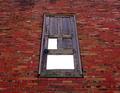
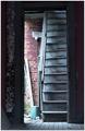
Stairs to Nowhereby sibelingComment: Somehow the gap between what the title tells us and what the photo tells us frustrates. Something about the stark vertical and horizontal lines makes parsing the photo difficult - there's no natural movement from one place to the next. Don't know if there would have been a way to get away with that had some part of the photo really caught the eye, but it's so subtle and understated that it's really hard to get drawn in. I wonder if it would have been better a little oversharpened or oversaturated. Or whether the subtle textures would have been better expressed in B&W. Or whether the composition would be less static if the door were not centered in the photo. |
| Photographer found comment helpful. |
| 04/14/2005 06:03:27 PM |
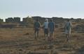
Loneliness Takes its Toll on an ANCIENT Fort!by doctabrezComment: The contrast of the photo is a little low - there appear to be no colors darker than about 8-12% of full value. This could be fixed in about 3 seconds in Photoshop. I'm afraid the four guys wearing hats do nothing for the photo. We're a little too far away from the subject to see anything interesting about it. Even if the sky had been filled with a beautiful sunset, it would be hard to argue that the photo was about and abandoned building and the photo would not have worked well. |
| Photographer found comment helpful. |
Home -
Challenges -
Community -
League -
Photos -
Cameras -
Lenses -
Learn -
Help -
Terms of Use -
Privacy -
Top ^
DPChallenge, and website content and design, Copyright © 2001-2025 Challenging Technologies, LLC.
All digital photo copyrights belong to the photographers and may not be used without permission.
Current Server Time: 08/11/2025 04:06:39 AM EDT.