| Image |
Comment |
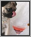
| 08/05/2005 11:15:40 PM |
Eccentricby ShutterPugComment: There's so much I love about this photo. And there's so much that seems a little odd. That is one cute dog, His expression is perfect. The jewelry is likewise perfect. I love the martini glass, its fluid color, and the fact that an object sits on its edge. There is a graininess and an unsharpness to the photo that greatly detracts. That darn olive strikes me as a problem both for its place at the edge of the photo and for its color - being just wrong to go with ny other colored item in the photo. Perhaps for some symbolic reason I do not understand, only an olive will do. If so then maybe the drink turns to a tawny gold or some other color that works with olive. While I love it that the placement of the olive draws our gaze past the martini glass and completes a kind of triad with the base of the glass and the dog's eyes (or tongue), it just seems like courteous treatment to your major elements not to chop them in half with the photo's edge. Good Luck. |
 Photographer found comment helpful. Photographer found comment helpful. |
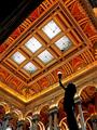
| 08/05/2005 11:00:50 PM |
just a little place for the booksby JPRComment: I've seen a lot of good architectural photos at this site, but this one beats them all; spectactular. Placement of the shadowy figure in the lower right corner has transformed a good photo into a great one. Bravo. |
| Photographer found comment helpful. |
| 08/05/2005 10:57:02 PM |
|
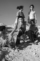
| 08/05/2005 10:49:32 PM |
...is a tricycle?by XileboComment: There's a profound otherworldy quality to this photo. The lighting is incredibly crisp. The expressions are very aware and adult-like. There is an interesting conversation taking place just with glances and turned heads. Very nice |
| Photographer found comment helpful. |
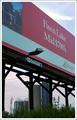
| 08/05/2005 10:45:39 PM |
I r r e v e r s i b l eby glad2badadComment: I love the political statement made by the framing. But I find the composition a little cluttered; I wonder if B&W might make the sign feel a little more shadowy and sinister - in the way I think you mean it to be? |
| Photographer found comment helpful. |
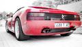
| 08/05/2005 10:39:31 PM |
car for beautyby bluephotoComment: I presume this is what this British beauty would look like stateside. Although it adds some weirdness to the colors of the reflections on the car, I like the selective desaturation. The low angle and short focal length were both very good choices. It is nice that we get to see the shadows under the car and the highlights and shadows of the tires, but it is a bit of an inconvenience to have the roof support pillar whited out due to reflection. |
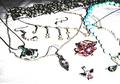
| 08/05/2005 10:34:29 PM |
Jewlsby rocklova72Comment: The harsh, directional lighting has done a great disservice to this photo. The photo is also badly served by the organization of the objects, IMO. I find these flaws collectively, make the photo very difficult to look at. |
| Photographer found comment helpful. |
| 08/05/2005 10:30:27 PM |
spoiled kittenby almostbiancaComment: Great expression. Super attention to lighting. And I like how the color of the purse is echoed by the background. I'm finding the headrests take up more of the photo's real estate than I'd like. Still, a nice effort. |
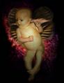
| 08/05/2005 10:25:17 PM |
angelflyby kwalkerComment: Sorry, I don't get it. I'm afraid I also am having trouble finding part of the photo I really like. |
| 08/05/2005 10:21:57 PM |
|
| Photographer found comment helpful. |
Home -
Challenges -
Community -
League -
Photos -
Cameras -
Lenses -
Learn -
Help -
Terms of Use -
Privacy -
Top ^
DPChallenge, and website content and design, Copyright © 2001-2025 Challenging Technologies, LLC.
All digital photo copyrights belong to the photographers and may not be used without permission.
Current Server Time: 08/04/2025 05:40:11 PM EDT.