| Image |
Comment |
| 02/16/2005 10:10:43 AM |
|
| 02/16/2005 10:08:14 AM |
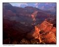
Grand Canyon Sunsetby RHoldenSrComment: The grand canyon is almost impossible to photograph well from most of the accessible points on the rim - judging from the number of bad shots I've of it , some my own. This shot begins to capture the color and line, the scale and drama of the place. The light and dark areas in front work perfectly to set off the rock formations of more distant canyon walls. Very nice. Message edited by author 2005-02-16 10:09:39. |
 Photographer found comment helpful. Photographer found comment helpful. |
| 02/16/2005 10:00:33 AM |
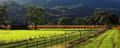
Road to Vejerby AranchaComment: I love the concept of this photo. I like the green against the steely gray of the sky. And the farm on the hill adds interest. The silky texture of thhe distant grass lit by low angle light makes the hills very strong.
Photos with this much sky need more interest than this sky happens to provide, I think. If the sky is 80% of the area of a photo, the viewer feels cheated if it is used entirely as a framing element as it is here. I wonder what the photo would look like if 3/4 of the sky were cropped out but the width remained the same. |
| Photographer found comment helpful. |
| 02/16/2005 09:48:39 AM |
Sonomaby EarlySaturdayMorningComment: Great lines, Striking color. The fence, the building, and the tree beside it really make the photo. Nice. |
| Photographer found comment helpful. |
| 02/15/2005 01:07:00 PM |
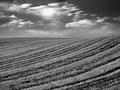
Furrowedby ImagineerComment: Kind of like crop circles - only its lines, its much bigger, and it probably wasn't done by space aliens! I'm always in awe of a photo of 'nothing' that looks fabulous; and this is a perfect example. |
| Photographer found comment helpful. |
| 02/15/2005 12:07:37 AM |
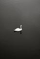
Oasisby ImagineerComment: Breaks every rule in the book: the rule of thirds, the rule about making the subject big, the rule about not letting the subject's surface be rendered so white or black that we cannot find detail in it. And I imagine lots more. But for all its 'flaws' it is a very good shot - and it is made better for each broken rule. |
| Photographer found comment helpful. |
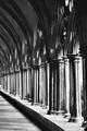
| 02/15/2005 12:03:13 AM |
arches hallwayby vandalComment: Gothic. Repeating patterns work so well in B&W. The lighting is strong enough to establish direction but diffuse enough that we can see much texture and detail even in the strong shadows. I apreciate that we cannot see the land outside the hallway this holds our attention in the interior space. Good work. |
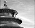
| 02/14/2005 11:37:24 PM |
Qinian Dianby elemessComment: I wonder if there is a view of this temple roof without the 'cake pan.' The ornament seems to ruin a really good photo of a remarkable piece of architecture. Perhaps the shot could be improved by cropping the blank space on the right.. The repeated elements on the circular form, seen over and over again in each incarnation from a different angle are really striking.. Nice work. |
| Photographer found comment helpful. |
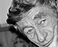
| 02/14/2005 11:25:38 PM |
Dadby Ecce_SignumComment: I like this photo much; it captures the spirit of a man with a distinctive face (didn't I see this man carrying a box in the 'pain' challenge?)
I know that I am on the lunatic fringe, but I like the contrast of the original - or at least I'd end up with it closer to the original version than to Mike Owen's. Mike Owen's cropping job seems to improve the photo considerably. It solves a number of problems and puts the emphasis right where it belongs. |
| Photographer found comment helpful. |
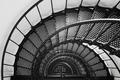
| 02/14/2005 11:12:42 PM |
Steps to the Topby hankinsComment: Strikes me more as a downward spiral... I guess I've never met a photo of spiral staircases I did not like and this is certainly no exception. I like the fact that the shot is not perfectly centered, because I find the wall adds an essential visual balance and contrast. IMHO, the picture begins to go a bit muddy after the third flight down. My own instinct would have been to climb to the top and try to make it look like the spirals ran out to infinity just as was done here; but in looking at this image, I can't help but wonder whether getting three good courses and the checkered floor might not be at least as effective...
In any case, it's a solid and interesting shot. |
Home -
Challenges -
Community -
League -
Photos -
Cameras -
Lenses -
Learn -
Help -
Terms of Use -
Privacy -
Top ^
DPChallenge, and website content and design, Copyright © 2001-2025 Challenging Technologies, LLC.
All digital photo copyrights belong to the photographers and may not be used without permission.
Current Server Time: 08/01/2025 02:30:30 AM EDT.