| Image |
Comment |
| 04/29/2006 11:59:52 AM |
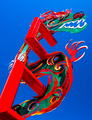
Sky Watcherby IRINAEDMComment: nice strong use of color here except the red on the left side seems to be on the verge of being blown... as strong as this is ... you may have elected to pull back the red channel just a touch |
 Photographer found comment helpful. Photographer found comment helpful. |
| 04/29/2006 11:58:17 AM |
|
| Photographer found comment helpful. |
| 04/29/2006 11:56:57 AM |
Easter Egg?by MarkBComment: actually I like the use of the colors ... would have been better IMHO to extend the yoke at the bottom of the frame |
| 04/29/2006 11:55:57 AM |
hot tomatillo?by sfaliceComment: neat idea... if the orange (red?) spill could have been controlled on the left a little more |
| Photographer found comment helpful. |
| 04/29/2006 11:55:01 AM |
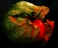
my shadesby nha7Comment: nice concept but doesn't come across cleanly |
| 04/29/2006 11:53:54 AM |
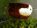
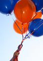
Balloonsby careComment: the banding on the orange balloon is a bit of an issue for me ... nice idea though |
| Photographer found comment helpful. |
| 04/24/2006 07:20:13 AM |
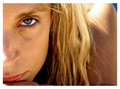
What are YOU thinking?by nomad469Comment: Not that anyone will read this ... but
The lack of "catchlights" is the result of the lighting style...
a large softbox is 90 degrees to the right of the model at about 18inches and silver reflector on the left to give some fill to the shadow side. the model was placed toward the forward wall of the softbox to create the feathered lighting. The blue light on the back left side of the face mask is controlled spill from the gelled background light.
Because there is no lighting to reflect a "catchlight" in front of the pupil of the eye and the lighting is so soft ... there is not a bright specular in the eye...It is by design.
This lighting style is a modification of one used by a photographer named Joe Craig.
What would I have changed ... the 2 speculars on the left eye. I like the deep shadow on the left side as it adds to the mood I was trying to create. |
| 04/19/2006 01:31:22 PM |
|
| 04/17/2006 05:56:05 AM |
"Amanda'by tfarrell23Comment: way way over processed... to much ni...the color balance is off... the eyes are blue there is no detail in the shirt... |
| Photographer found comment helpful. |
| 04/17/2006 05:52:02 AM |
Togetherby sigrun_thComment: this could have been very nice... a couple of things dont work for me ...
the lighting seems to be flat really really needs to boost the contrast and drop the exposure a tad.
you have a copystand type lighting happening here. play with moving the main light a little more to center |
| Photographer found comment helpful. |
Home -
Challenges -
Community -
League -
Photos -
Cameras -
Lenses -
Learn -
Help -
Terms of Use -
Privacy -
Top ^
DPChallenge, and website content and design, Copyright © 2001-2025 Challenging Technologies, LLC.
All digital photo copyrights belong to the photographers and may not be used without permission.
Current Server Time: 08/04/2025 02:46:54 PM EDT.