| Image |
Comment |
| 08/26/2005 02:49:44 PM |
|
 Photographer found comment helpful. Photographer found comment helpful. |
| 08/26/2005 02:49:10 PM |
Sleeping Beautyby menardmamComment: I love the softness of this shot, evrything appears so smooth. Very well done. Good luck. |
| Photographer found comment helpful. |
| 08/26/2005 02:48:16 PM |
|
| Photographer found comment helpful. |
| 08/26/2005 02:47:14 PM |
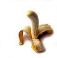
Play on words.by parrotheadComment: Some may not like your play on words. But I applaud you for taking the risk. The light on the knee is a little hot. Good luck. |
| Photographer found comment helpful. |
| 08/26/2005 02:36:38 PM |
|
| Photographer found comment helpful. |
| 08/25/2005 09:22:10 PM |
The Yogurt Towerby CSDragonComment: I would have liked this more if the yogurt straight on from the lense, instead it looks uneven. |
| 08/25/2005 09:16:12 PM |
|
| Photographer found comment helpful. |
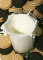
| 08/25/2005 09:14:13 PM |
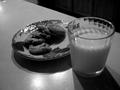
Milk and Cookiesby darkornithopterComment: The strong shadows adn overall darkness hurt this shot. Also hot spots and whatever is in upper left corner is distracting. |
| Photographer found comment helpful. |
| 08/25/2005 09:11:29 PM |
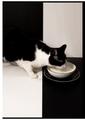
Tastefulby fotodudeComment: The border hurts this and is actually a distraction. Especially being white on three side and blac on one, makes it look like a bad corp. Top right square needs to be the same shade of white as lower left. |
| Photographer found comment helpful. |
| 08/25/2005 09:04:25 PM |
|
| Photographer found comment helpful. |
Home -
Challenges -
Community -
League -
Photos -
Cameras -
Lenses -
Learn -
Help -
Terms of Use -
Privacy -
Top ^
DPChallenge, and website content and design, Copyright © 2001-2025 Challenging Technologies, LLC.
All digital photo copyrights belong to the photographers and may not be used without permission.
Current Server Time: 08/26/2025 02:56:48 PM EDT.