| Image |
Comment |
| 04/18/2005 03:42:52 PM |
|
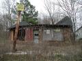
| 04/18/2005 03:42:01 PM |
Keep Out Collapse Inby SchmalComment: I think I would have tried to get an angle of this building where the sign on the post wasn't included. I doesn't add anything and distracts from the building. |
| 04/18/2005 03:39:57 PM |
|
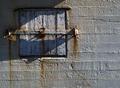
| 04/18/2005 03:35:41 PM |
No Entryby jonrComment: The lighting just seems a little to harsh on this. Maybe cropped some off the right side. |
| 04/18/2005 03:34:05 PM |
Room with viewby carodaniComment: I think I would have cropped this thighter at the bottom to show a little more detail of the building. |
 Photographer found comment helpful. Photographer found comment helpful. |
| 04/18/2005 03:32:29 PM |
Forgotten splendourby RussComment: One of the better b&w ones I've seen. Would have liked to see a little bit brighter white trim. Bumping up. |
| Photographer found comment helpful. |
| 04/18/2005 03:31:11 PM |
left behindby dewedComment: Bumping this up, even though I think I would have cropped tighter on the right, maybe eliminate pole on the right. |
| Photographer found comment helpful. |
| 04/18/2005 03:29:21 PM |
|
| Photographer found comment helpful. |
| 04/18/2005 03:28:48 PM |
The Path Homeby photogJamesComment: Framing idea was good as was the walk way leading up to the house. I think I would have cropped a little more of the tree out. House color and grass could have used a little more pop. |
| Photographer found comment helpful. |
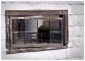
| 04/18/2005 03:26:04 PM |
Through the Window and Beyondby twbrozComment: Nice idea, focus is too soft though on the left side of the window. I would have liked everything in sharp focus on this better. |
| Photographer found comment helpful. |
Home -
Challenges -
Community -
League -
Photos -
Cameras -
Lenses -
Learn -
Help -
Terms of Use -
Privacy -
Top ^
DPChallenge, and website content and design, Copyright © 2001-2025 Challenging Technologies, LLC.
All digital photo copyrights belong to the photographers and may not be used without permission.
Current Server Time: 08/24/2025 01:54:17 PM EDT.