| Image |
Comment |
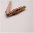
| 01/27/2005 01:14:15 AM |
The Long and Short of It....by tfarrell23Comment: I like the idea, but the pencils being pointed toward the left edge of the picture causes the entire lower-right portion of the picture to be merely wasted space. Perhaps cropping could help, or keeping the composition the same but with the short pencil on the other side of the longer one. |
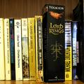
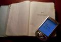
| 01/26/2005 07:00:25 AM |
Literature Bridges Timeby MarkComment: Judging by the reflections off the slick, new bindings I'm guessing that there was light coming in from behind the camera (or from the flash). This light needs to be removed so that it doesn't obscure any of the titles. Other than that, I like this picture and its message. |
 Photographer found comment helpful. Photographer found comment helpful. |
| 01/26/2005 06:53:12 AM |
Last drop ...by andr00Comment: So you're saying that fountain pen users have a lack of 'ctrl' over the ink? I think using a keyboard of a different color than the background would make it more distinguishable. Otherwise, good picture. |
| Photographer found comment helpful. |
| 01/26/2005 06:49:45 AM |
|
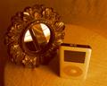
| 01/26/2005 06:48:31 AM |
i pod and mirrorby leifurComment: Yes, the iPod is new and the mirror is old, but I don't see why they are related. In other words, why are they in the picture together? |
| Photographer found comment helpful. |
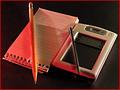
| 01/26/2005 06:44:49 AM |
Downsizedby HOOlovesdrumsComment: I would like this picture a lot more if there was only one light source. The interfering shadows messes up the image for me. Still, I give it a 7. |
| Photographer found comment helpful. |
| 01/26/2005 06:24:08 AM |
|
| 01/26/2005 06:20:54 AM |
|
| 01/26/2005 05:41:54 AM |
Mitutoyoby alanbataarComment: This picture could have used some more light over the rest of the picture rather thaan just the center. |
| Photographer found comment helpful. |
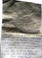
| 01/26/2005 04:53:19 AM |
WARby 4scoreComment: I really like this idea and its execution. The language in the Civil War letter seems a bit modern for when it was supposed to be written. Also, I think yellowing the upper portion of the letter would do better in suggesting its age while making it easier to read. Small quibbles, though. 9 |
| Photographer found comment helpful. |
Home -
Challenges -
Community -
League -
Photos -
Cameras -
Lenses -
Learn -
Help -
Terms of Use -
Privacy -
Top ^
DPChallenge, and website content and design, Copyright © 2001-2025 Challenging Technologies, LLC.
All digital photo copyrights belong to the photographers and may not be used without permission.
Current Server Time: 08/01/2025 07:32:10 PM EDT.