| Image |
Comment |
| 03/02/2006 10:40:09 AM |
My favorite song!by nico_blueComment: The reds in this picture don't go together particularly well IMO. None of them match, nor do they compliment one another. Perhaps a different coloured background would have improved things. |
 Photographer found comment helpful. Photographer found comment helpful. |
| 03/02/2006 10:38:41 AM |
|
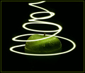
| 03/01/2006 01:17:36 PM |
Appealing Light by hokieComment: I particularly like the reflection on the apple, and the detail visible in the drops of water. |
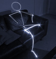
| 03/01/2006 01:16:49 PM |
Lightmanby ksymeonComment: I really like this picture. I assume you used an LED or something to trace the body in the air?
Very impressed. |
| Photographer found comment helpful. |
| 03/01/2006 05:07:34 AM |
Mercurialby JonoComment: I honestly thought this picture would do a little better than 4.7, but never mind. I probably shouldn't have entered a challenge with over 600 entries for my first attempt!
The title "Mercurial" basially means 'Moody'. If you look it up in a dictionary, you'll find an explanation of 'Quick and changable in temperement; Volatile.' Click here for definition
As for the choice of duotone colour, I wanted the whole feeling of the image to portray that 'moody' feeling. Despite my score, I'm really pleased with my photo.
Many thanks to my wonderful girlfriend for putting up with me! :-) |
| 03/01/2006 04:04:50 AM |
|
| Photographer found comment helpful. |
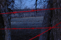
| 03/01/2006 03:58:58 AM |
Keep Out!by kdmeadsComment: How did you get the barbed wire in the foreground to appear red?
Also, where's your moving light source? :-P |
| 03/01/2006 03:56:16 AM |
Mother's Portrait!by richabhatiaComment: Rated low since it doesn't meet the challenge.
Aside from the challenge criteria, one thing that detracts from this picture is the face in the background, just next to the chin of your Mother. Would be far better without the 2nd face. |
| Photographer found comment helpful. |
| 02/23/2006 05:33:30 AM |
|
| Photographer found comment helpful. |
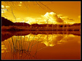
| 02/23/2006 05:14:03 AM |
Come On Downby lytaComment: The white is a little over exposed, which detracts from the rest of the image somewhat. |
| Photographer found comment helpful. |
Home -
Challenges -
Community -
League -
Photos -
Cameras -
Lenses -
Learn -
Help -
Terms of Use -
Privacy -
Top ^
DPChallenge, and website content and design, Copyright © 2001-2025 Challenging Technologies, LLC.
All digital photo copyrights belong to the photographers and may not be used without permission.
Current Server Time: 08/04/2025 02:32:11 AM EDT.