| Image |
Comment |
| 09/15/2005 08:00:53 PM |
MILKby johnnyBirdComment: Nice work. I would suggest a thin white border then the black border. This way it is not lost in the photo. The noise works well here but would like to see it with it raqn through Neat Image. Nice framing....Might I suggest as another title option "Don't Cry Over Spilled Milk" Good work and welcome to DPC. I look foward to seeing more of your work. |
| 09/12/2005 08:26:07 PM |
ocean lines 3.jpgby rasdubComment: I love the textures and the tones also. Really pleasing to the eye. Really wish I could suggest something to change but it just looks like a well taken image. |
 Photographer found comment helpful. Photographer found comment helpful. |
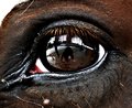
| 09/12/2005 05:15:10 PM |
Selfportrait ed1 rs.jpgby Sherri1209Comment: Only thing I don't like is the white spot on the top left of the image. Spot on focus regardless. Such detail in the eyelashes. |
| Photographer found comment helpful. |
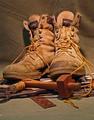
| 09/12/2005 04:24:57 PM |
"TOOLS OF THE TRADE"by EELSCARComment: *Crtique Club*
The image is nice overall. DOF is nice and the focus is spot on. However the lighting bothers me. The shadow behind the left boot also bothers me. You do have an interesting subject with all the right tools below it. The lighting seems a little bright at top and a little too dark on the left side of the photo. The tools add a nice touch to the image either way though. I noticed you are rather new to DPC. This is IMO a fine first entry and I see an average vote of 5.2628 on this image. Pretty stong in this crowd. If you have any questions just pm me. I will be glad to answer them. |
| 09/12/2005 12:18:30 PM |
Leigh, Matthew and Helenby RiponladyComment: Focus seems a little off. As I look at it it seems the focus is on the tie and not all the people in the photo. This is a great expression you captured either way. Try to sharpen it a little if you use PS. I like the pov also. |
| Photographer found comment helpful. |
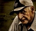
| 09/11/2005 11:23:57 AM |
Difficult Lifetimeby Joey LawrenceComment: *Critique Club*
I go in to get a Critique Club image to critique. This is the second one. Many of us (including me) feel like we have a lot to learn compared to you. But how many times have you heard that? I am going to critique this image like I do the rest and if you have any questions don't hesitate to pm me and cuss me out. Ok on with the critique.
When I first looked at this image and many other images of seniors they all seem to tell a story of a life lived and this does just that. I love the effect on this image your now trademarked grunge look. The lines on his face are perfect and the fairly new Budweiser hat goes along very well with this image. The look in his face says it all to me. The only problem I have with this is it looks as if the top of the ear is slightly off on focus. I would like to see it all of him in focus. Overall I really like it. I think you have captured a moment in this long life and should cherish this one. |
| Photographer found comment helpful. |
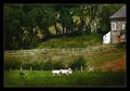
| 09/11/2005 11:11:49 AM |
Dafad Llanymddyfri, Dog & Lambby postoakinversionComment: *Critique Club*
Overall you have a nice image. With the title I wonder why you didn't crop closer in to your subject. You have very nice color and have done a good job by stopping the motion. I don't like how half of the house is cut off. I think it would be a lot better without the house. The black border is a little big for my taste but doesn't take away from the photo itself. Focus looks to be spot on. You do seem to have a few blown highlights in the lamb. Overall nice job with nice bright colors and a photo that is pleasing to the eye. |
| Photographer found comment helpful. |
| 09/11/2005 10:31:49 AM |
Golden Lagoonby rox_roxComment: Now this dock is much better imo. The golden color really offsets it. The beams of sunlight are marvelous as well. Keep that A80 around it seems you really know how to use it. |
| Photographer found comment helpful. |
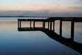
| 09/11/2005 10:30:02 AM |
Dock on Blue Waterby rox_roxComment: Very nice shot. The only problem I see is see how the dock meets up with the horizon on the right. I woulod raise or lower the POV if you have another chance to shoot. Either way you have a nice photo. I also love the calmness of the water here. |
| Photographer found comment helpful. |
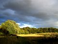
| 09/11/2005 10:25:51 AM |
clouds 2by RiponladyComment: The trees seem a little blown out from the sunlight. Maybe just shot at the wrong time of day. I like the clouds and a nice blue color in the sky. Maybe play with curves in photoshop if that is what you use and try to tone done the overpowering brightness of the sun to some extent. |
| Photographer found comment helpful. |
Home -
Challenges -
Community -
League -
Photos -
Cameras -
Lenses -
Learn -
Help -
Terms of Use -
Privacy -
Top ^
DPChallenge, and website content and design, Copyright © 2001-2025 Challenging Technologies, LLC.
All digital photo copyrights belong to the photographers and may not be used without permission.
Current Server Time: 08/13/2025 02:08:30 AM EDT.