| Image |
Comment |
| 03/20/2006 09:18:00 PM |
Blueby TuckersmomComment: I have looked through your portfolio here before. Although I haven't done so recently I think this is one of your best photos ever so far. I really love the blue tone you have chosen. Focus is spot on and composition is great. If this was in the blue challenge a few weeks back I would have given you a 10 and not even second guess it. I can see how your work has improved. Keep it up. |
 Photographer found comment helpful. Photographer found comment helpful. |
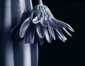
| 03/20/2006 09:13:11 PM |
jess full.jpgby jpochardComment: I like it. The background is great for this. I also agree with the other too comments. It has a retro feel to it. |
| Photographer found comment helpful. |
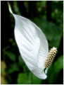
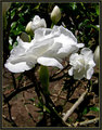
| 03/20/2006 09:11:47 PM |
peace lily.jpgby jpochardComment: I am not sure if I am a big fan of the soft focus. Althought the main part of the subject appears to have good focus. But I really like your composition. It is a very nice image. I think I would give it a little more room at top. The border really does add to this shot. |
| Photographer found comment helpful. |
| 03/20/2006 06:35:45 PM |
Star in the gardenby magueroComment: Only thing I see to change. Clone out the dark spot on the top right. Kinda looks like a fly. Other than that do nothing. It is a great shot. Be proud. |
| Photographer found comment helpful. |
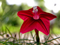
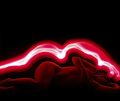
| 03/20/2006 06:34:35 PM |
red temptationby magueroComment: Nice closeup. The shade kinda kills it though. Focus and composition are good I would just like to see a little more light. |
| Photographer found comment helpful. |
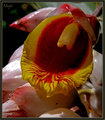
| 03/20/2006 06:33:53 PM |
P3190301c.jpgby magueroComment: Lighting seems a little harsh. I would go back and take another crack atr it just after sunrise or just before sunset. I like the border. |
| Photographer found comment helpful. |
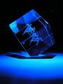
| 03/20/2006 06:32:45 PM |
Sagittariusby magueroComment: Very nice job. The blue light is noce and the focus is great. Just above the right side of the cube looks to be some sort of reflection. Too bad is was basic editing or you could have just cloned it out. Nice shot that placed well. |
| Photographer found comment helpful. |
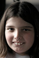
| 03/19/2006 07:26:55 PM |
sandra trappedby smilebig4me1xComment: I like the softness of this one more. The difference between this one and the one of your other daughter are miles apart as far as lighting goes. Whever and whatever time this was redoJessi on this same spot. Very good job. |
| Photographer found comment helpful. |
| 03/19/2006 07:25:20 PM |
jessi trappedby smilebig4me1xComment: I think there is a little too much light on the right side of her face (our left) Also the earing to our right is a little distracting. It is a very good portrait of your child and all of those are usually the best even if there is a little here or there that can be fixed. Good job Cher. |
| Photographer found comment helpful. |
| 03/19/2006 07:06:30 PM |
Pretty in Pinkby GIS_boyComment: This was the photo that caused all the ruckus. Well I really liked this shot either way. The only problems I have is I think you have too much black space up top and if you wouldn;t have cut off her toes or elbows I would have given you a 9 had I voted in this challenge. The reason I say 9 is because the arm is in the way for a 10. :-)
Wonderful and creative you were with this one and a well deserved 7th place. |
| Photographer found comment helpful. |
Home -
Challenges -
Community -
League -
Photos -
Cameras -
Lenses -
Learn -
Help -
Terms of Use -
Privacy -
Top ^
DPChallenge, and website content and design, Copyright © 2001-2025 Challenging Technologies, LLC.
All digital photo copyrights belong to the photographers and may not be used without permission.
Current Server Time: 08/09/2025 10:38:17 AM EDT.