| Image |
Comment |
| 03/11/2008 11:44:17 AM |
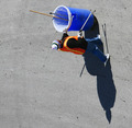
Up Hill Battleby holdingtimeComment: Your title denotes the subject is walking up hill, yet you've rotated to look like he's walking the side of a building. Maybe if you rotated so his shadow was at vertical, it might look better. |
 Photographer found comment helpful. Photographer found comment helpful. |
| 03/11/2008 11:40:36 AM |
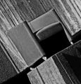
Padlockedby neophyteComment: Nice texture of the paint. The "new" master lock doesn't seem to fit with the rusted hinge and handle. |
| Photographer found comment helpful. |
| 03/11/2008 11:39:05 AM |
We're Having a Party!by cstein96Comment: I can't really tell where the focus is. Right now it looks like its focused on the white balloon, but I would say the ribbon is more of a key point. Try a smaller aperature next time to get keep the ribbon crisp. |
| 03/11/2008 11:34:57 AM |
|
| Photographer found comment helpful. |
| 03/11/2008 11:33:42 AM |
....evening walk by dougi555Comment: Love the strong shadows. My only nitpick is you cropped the tip off the shadow of the ball. |
| Photographer found comment helpful. |
| 03/11/2008 02:12:53 AM |
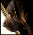
The View from Hereby IvoryComment: Good photo, but I don't see how the tilt adds anything to the photo. Still its a great capture of your pooch. |
| Photographer found comment helpful. |
| 03/11/2008 02:10:41 AM |
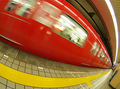
Red Subway in Nipponby tamatamaComment: You've captures some great things in this photo. The colours really stand out, the motion blur adds speed, and the leading lines are perfect. Also, the fisheye is soo cool. |
| Photographer found comment helpful. |
| 03/11/2008 02:07:30 AM |
This is Artby willhadlComment: The chair blends too much with the concrete(?) behind. Because of this, the subject does not stand out. |
| 03/11/2008 02:05:28 AM |
Craneby hanserikComment: Really clean and sharp. The crop is too close in the bottom right corner. The crane leads my eyes to that corner and out of the frame. Try cropping tight to the top left corner if you can and leave some sky to the right. |
| Photographer found comment helpful. |
| 03/11/2008 02:00:05 AM |
Awayby macrothingComment: The subject is too centered. But I like the colours and the lines in the background. |
| Photographer found comment helpful. |
Home -
Challenges -
Community -
League -
Photos -
Cameras -
Lenses -
Learn -
Help -
Terms of Use -
Privacy -
Top ^
DPChallenge, and website content and design, Copyright © 2001-2025 Challenging Technologies, LLC.
All digital photo copyrights belong to the photographers and may not be used without permission.
Current Server Time: 08/04/2025 08:09:26 PM EDT.