|
|
| Image |
Comment |
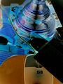
| 01/14/2005 05:31:58 PM | Online Bingesby msdoubletroubleComment: My first thought is this has been overmanipulated. My second thought is the composition is unintriguing: the near centered mouse and light base surrounded by clutter. There's no 'subject' to the image: everything competes with everything else for attention, and eventuall the eye is pulled by the mouse cord up and out of the image by the (?) which, by rights of contrast and detail, probably should be the subject, but is only partially in the image.
I apologise for having nothing to compliment, but these are just my opinions. |
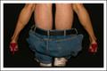
| 01/14/2005 05:25:30 PM | Start A Familyby photomayhemComment: Humorous, and the ladies legs are attractive. Somehow, the perspective seems off; I think it's because the male model kept a discreet distance from the female model. Let's not go into the other implications.
Compositionally, the pale legs of the man draw the viewers eyes up and out of the image for no successful reason. The position of the flash made the male's legs look paler, while the shoes look underexposed and the trousers dingy.
Darkening the man's legs and lightening the woman's would draw the viewer's eyes past the man and add a feeling of depth to the image.
It wouldn't hurt to saturate the red shoes, as I get the same feeling of under-exposure when I look at them.
Just my thoughts. |  Photographer found comment helpful. Photographer found comment helpful. |
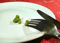
| 01/14/2005 05:17:37 PM | Eat less...by _wu_Comment: Hey _wu_
The most interesting aspect of this photo, for me, is the detailed grain in the metal of the fork. It is also the most distracting as it pulls attention away from the the 'subject': the peas. The strong lines of the fork and knife, doubled by the high contrast of these utensils agains the white plate, add to this effect of pulling the viewer out of the photo. The peas seem inconsequential when they should be the main focus.
Witout the utensils, however, the image is bland.
Just my thoughts. |
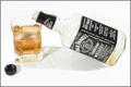
| 01/14/2005 03:56:12 PM | The Last Glass of JDby troyloxComment: Troy
You've done a nice job with the ambient lighting: it defines shape nicely, without overt glase.
For me, though, the composition is a bit static. Depth could have added by angling the bottom of the bottle away from the camera, and revealing the open mouth of the bottle slightly, to match the circle of the glass and the cap. The position of the cap in the composition pulls the eye away from the central image, as there' a lot of contrast between the cap and the surface.
I'd like to see the glass stand out as a subject: backlight focussed into the whiskey would have made the liquid glow and draw the eye to it, making the glass the subject. The whiskey looks a bit muddy and less desirable as is.
Contrast: I think the black of the labels could be a bit deeper. That would help the gold of the whiskey stand out. I'd also like to see a bit textural contrast; perhaps a textured cloth or tablecloth under the glass and bottle.
Furthermore, if this is meant as an ad shot, some 'elegant' props to make this appear a high-class setting would help sell the product.
As is, I think the entire setting is a bit bland.
Hope I've given you something to think about. | | Photographer found comment helpful. |
| 01/09/2005 10:48:01 AM | More time looking; less time shootingby e301Comment: Ed
This was one of my top three. You have a nice eye and a subtle touch with editing. Personal taste would have asked for a twek in the contrast, but his has a nice moody feel theat might be lost if you did so.
Nice work. | | Photographer found comment helpful. |
| 01/06/2005 03:59:00 PM | Gas Mask (aka, antique soda bottle)by MJENNIComment: Mark
Nice combination of colors, and the bottle stands out nicely against the blurred surface. I would guess a good portion of the blurring was edited in, but if so, it was subtly done and doesn't scream 'manipulation'. If it wasn't edited in, then I'd say "Nice use of DOF".
Theres only one nit, and I'm ambiguous in my thoughts about it. The blurred portion of the glass, in the upper left, stands out against the sharp portion, just as a sharp subject stands out against a burred background. On the other hand, it keeps the viewers eye from folling the sharp line out of the image. Personally, I think I'd like it better if it weren't so soft.
There's also a barely noticeable line from the neck to the left of the image which might be cleaned up.
Thanks for posting this one. I enjoyed it. |
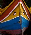
| 01/06/2005 03:48:33 PM | Weathered And Beatenby dpdaveComment: Dave
Such a forlorn look fits the condition of the boat *grin*. It's a natural subject fo a photograph, and on of my favorites in the challenge.
You've done a nice job capturing the tonal range and the detail of the flaking paint. The composition puts the 'face', and the lines of the boat pull the viewer's eye there.
My first suggestion assumes our monitors are calibrated the same, but the colors look slightly muddy to me. I've found a one-stop over exposure lends a 'snap' to darker subjects, without a loss of highlight detail. The muddiness may not show on your monitor, though - a difficulty with online images.
My only other minor nit are the 'holes of light' at the left edge of the image. They tend to pull my eye away from the subject.
Just my thoughts. A very nice image.
Jerry | | Photographer found comment helpful. |
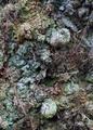
| 01/05/2005 07:59:53 PM | faceby visaksenComment: Villy
I like the spread of subtle pastel colors and the sense of age in the 'face'. Technically, the only nit I have is the branch at the lower left appears to be out of focis; but that just might be a trick of light, since I'm looking at a low-res image.
Artistically, I tink you could darken the area of the left 'eye' to make the 'face' instantly recognisable. Perhaps the 'mouth', also, then lighten some of the highlights for a bit more 'snap'.
Just personal opinion, of course.
I didn't vote in this challenge; I would have rated this higher than the average you received. It's a clever piece of work.
Jerry | | Photographer found comment helpful. |
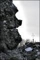
| 01/05/2005 07:49:23 PM | Human lollipopby DufusComment: Stefan
While the rock has an interesting profile, and you made humorous use of the formation, the low contrast of the rock makes it difficult to get involved with the interesting detail of the rock. The obvious manipulation of the sky bothers me, as does the out-of-focus 'lollipop'.
I think you would have had a nicer file to work with if you'd closed the aperture for a longer depth of field and used a slower shutter speed, possibly opening up the combination a full stop to add sparkle to the highlights.
This is all personal preference of course, and I see from the comments others disagree with me. I see a greater potential for this image, however, and applaud the eye that saw the figure.
Jerry | | Photographer found comment helpful. |
| 01/03/2005 06:37:17 PM | Tower Bridgeby Zap228Comment: Nice shot! If you could color correct the greenish lights to a yellow, I think it might work better with the hue of the sky. | | Photographer found comment helpful. |
Home -
Challenges -
Community -
League -
Photos -
Cameras -
Lenses -
Learn -
Help -
Terms of Use -
Privacy -
Top ^
DPChallenge, and website content and design, Copyright © 2001-2025 Challenging Technologies, LLC.
All digital photo copyrights belong to the photographers and may not be used without permission.
Current Server Time: 08/03/2025 09:23:55 AM EDT.
|