|
|
| Image |
Comment |
| 01/23/2005 11:35:31 AM | advancementby coldaComment: A nice shot. I agree with the comment about fore ground space, but I like the amount of negative space; its seems commentary on the corporate world. Effective use of lighting and focus, though you may want to comsider burning in that bit of glare at the bottom of the prominent pawn.
|  Photographer found comment helpful. Photographer found comment helpful. |
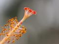
| 01/22/2005 04:19:22 PM | Pistil and Stamenby umbrisComment: I have problems with the point of focus. For me, the red tips should be the focus of the image - yet they're not on the depth of field. The field of focus begins past them, evidenced by the yellow 'buds' that are in sharp focus.
We used to use a photographer's loupe for focusing on ground glass; it would be a help in macro focusing also, if you're using the LCD. Inexpensive one can be found and are great for critical focusing.
This seems a weak splash of color against a blurred background, to me. Nothing grabs my eye. Sorry I can't be more positive. | | Photographer found comment helpful. |
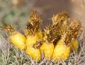
| 01/21/2005 09:04:04 PM | Saguaro Fruitby ClubJuggleComment: CJ
My eye keeps getting pulled to the brightest 'stalk (?)' in back (unfocussed). Perhaps burn it in and darken it. I would like to have seen the back fruit in focus, and the colors saturated a bit more, but that's just personal taste.
Maybe crop out some of the background? It may just be my middle-aged eyes can't handle it, anymore. *grin* | | Photographer found comment helpful. |
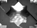
| 01/21/2005 10:23:52 AM | Through the Bridgeby fotodudeComment: Brando
Nice composition, but the attention remains on the mason work, and I'd like to see it drawn down the road. This might not have been the best subject for 'bokeh', per se. If the road were in focus, the lines would pull the viewer's eye down th road, so they'd wonder what it led to.
As is, the mason work needs to be sharper and burn in the corners so they're not as distracting. | | Photographer found comment helpful. |
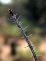
| 01/21/2005 10:18:58 AM | Desert Thornsby BAMartinComment: Barbara
I can't find any technical nits: nice use of backlighting and aperature size to make the limb stand out from the background. Compositionally, the image doesn't do much for me. The tones of the branch blend with the tones in the background. Nothing really pulls my eye away from the specular lights on the thorns. The red tip is nicely placed, but again, not saturated enough to demand attention. The black blur in the background, angainst the highlighted tan, pulls the eye more.
Just my opinions, of course.
| | Photographer found comment helpful. |
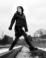
| 01/16/2005 01:07:15 PM | The Short Cutby ColeyComment: Coley
A very nice shot, indeed.
The low angle forces the eye first to the snow, then along the track, up the leg and body, to the face. The look on the subject's face is intriguing. The viewer wonders what she's looking at - a train, perhaps?
My one nit is the highlight you did around the girl's head. It says 'This shot has been edited.' Can you blend it in to the sky do it's not noticable. Or can you redo it, so it just affects the girl's face? It's really no distracting, but I thought I should mention it can be noticed.
Nice work. | | Photographer found comment helpful. |
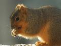
| 01/16/2005 12:51:35 PM | Caught In The Act (Eating The Birds Food)!!!by DrakeComment: Drake
Nice crop and use of backlight and DoF.
The one nit I have here, is the color and tone of the squirrel's coat blend too clsoely to the background, even thought the backlight helps delineate the shape. The squirrel lacks any 'snap', which I think could be lessened by adjusting the contast of the squirrel's coat. Darken the shadows and lighten the highlights of the coat and the subject will stand out more.
Nice candid shot. |
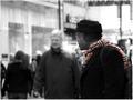
| 01/16/2005 12:37:00 PM | When The Smoke Clears.....by ChiquiComment: chiqui
This is a nice shot. The blurred background and use of color highlight the subject nicely, and the scraf leads the eye to the smoke, which is light enough to stand out against the background - and the face of the passerby in the background seems to give commentary on the smoke.
My one nit with the image is the bright spot in the upper right corner. It offers competition to the puff of smoke. If you could burn that area in, make it a bit darker, it wouldn't pull on the viewer's eye, trying to take it away from the center of the image.
Nice job. | | Photographer found comment helpful. |
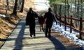
| 01/16/2005 12:19:06 PM | 1...2...3...Swingby jjbates4Comment: The strength of a candid id being able to capture a meaningful moment in time, when you only have a moment to get it technically correct. You've done that nicely.
The weakness of a candid shot is you can't choose all the elements in the enviroment. You can use 'darkroom' techniques for improvement, hoever, which you've done. That's where I'll keep my comments, however.
If I close my eyes and open them, the first place my gaze is drawn to is the high contrast patch of snow along the fence. There are no visual elements to lead my eye anywhere else, so I have fo force my attention elswhere, rahter than have the image guide it. The second spot that grabs my attention is the bright section of road at the top of the image. The difficulty is, neither of these two spots are the subject of the image. You'd like the viewer's attention to go directly to the child. To do that, I think you need to lower the contrast of the two trouble spots I mentioned, and increase the saturation of the child's coat.
The path and wooden fence are nice lines that would help lead the eye to the child, if it weren't for the two hot spots.
Just my opinions. |
| 01/16/2005 11:58:28 AM | Off Camera Jokeby daveitComment: dave
It's a nice candid shot. In candids, we can't choose much of the enviroment, only the moment. You chose a good moment, and made an excellent choice of aperature and shutter speed to do as best you could with the background.
The difficulty of the shot, for me, is the combination of saturated jacket and the high contrasr of the background, pull my attention away from the subject's nice expression, which should be the focal point of the composition.
Suggestions? Desaturate the coat (have you tried B&W?), and lower the contrast of, or crop out, the upper portion of the image. I believe these suggestions would center the viewer's attention on the subject, and improve the effect of the image. |
Home -
Challenges -
Community -
League -
Photos -
Cameras -
Lenses -
Learn -
Help -
Terms of Use -
Privacy -
Top ^
DPChallenge, and website content and design, Copyright © 2001-2025 Challenging Technologies, LLC.
All digital photo copyrights belong to the photographers and may not be used without permission.
Current Server Time: 08/03/2025 06:48:49 PM EDT.
|