| Image |
Comment |
| 04/07/2005 11:02:06 AM |
D...by luciferoComment: Great and original subject and fairly good composition. I only feel your image lacks a bit of light and more vibrant colors. Anyway, good job. 7 |
 Photographer found comment helpful. Photographer found comment helpful. |
| 04/07/2005 10:59:37 AM |
X-Factorby biggood53Comment: Though you have a very simple and not so interesting subject, you've managed to take a great, sharp and very detailed shot. I think you made the right option in turning this to b&w. Nice job. |
| Photographer found comment helpful. |
| 04/06/2005 04:25:15 PM |
Spring on the Farmby jeweliekComment: Great colors, contrast and composition - love the spring on this farm. I only wish your picture were larger... Very well done, though. |
| 04/06/2005 04:21:50 PM |
Aby arnitComment: Plain and simple image. I like it, though I'm not sure this would not look better in colors. Weel done.
PS - You seem to have some dirt (??) spots on your lens (I see 4 or 5 spots) in the sy area. |
| 04/06/2005 04:14:00 PM |
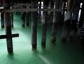
Under The Wharfby RolandBComment: I'm not sure which letter or letters you tried to depict (I see an F and one or more H's), but i like your photo - especially the water color and light - even though I'm not thrilled by your composition. |
| Photographer found comment helpful. |
| 04/06/2005 04:08:09 PM |
Last Letter Against Wavesby gciboComment: Nice picture and very well captured "Z". I only feel your photo lacks a little rotation (in order to straighten the horizon line) and a little more vibrant colors - the blue seems a little flat and dull (at least on my monitor). Well done, though. |
| Photographer found comment helpful. |
| 04/06/2005 04:05:13 PM |
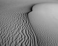
"M" in the sandby pitsamanComment: Great shot! Love the texture and the b&w. It also has great definition and quality. Congratulations. |
| Photographer found comment helpful. |
| 04/06/2005 04:01:35 PM |
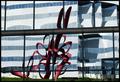
B...raby carodaniComment: You mean, "B...reast"... Nice B - the picture is certainly original and catchy, with great definition and overall quality. Nice job. |
| Photographer found comment helpful. |
| 04/06/2005 03:59:03 PM |
N formed by distorted reflectionby nrulkovComment: I really like your image and the abstract composition. However, I'm afraid your "N", which is now clear to me, is a little too small and placed in a poorly chosen picture area, I believe... I mean, because the picture is complex, one gets lost looking from one side to the other, in search of the "N". But I still like a lot. Good job. |
| Photographer found comment helpful. |
| 04/06/2005 03:47:39 PM |
D'Qued Jarby librodoComment: Very nice picture. Love its colors and composition and the overall feel. Good job. |
| Photographer found comment helpful. |
Home -
Challenges -
Community -
League -
Photos -
Cameras -
Lenses -
Learn -
Help -
Terms of Use -
Privacy -
Top ^
DPChallenge, and website content and design, Copyright © 2001-2025 Challenging Technologies, LLC.
All digital photo copyrights belong to the photographers and may not be used without permission.
Current Server Time: 08/04/2025 11:25:11 PM EDT.