| Image |
Comment |
| 02/12/2006 04:43:54 PM |
|
| 02/11/2006 04:30:07 PM |
Deathby charalesComment: without the title i would think it is a fine, almost abstract composition, the scythe looks like a drill at first sight, adding a funny moment to the grey topic and tone :-)
and with the title it is even finer
(though obviously not appreciated accordingly) |
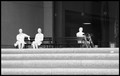
| 02/05/2006 04:06:50 PM |
Daily Routineby ecameronComment: Out of your portfolio, I like this one best - I tend to prefer b/w pictures, but in addition, it seems to have a style and a story, as other comments suggest.
I did not notice any noise (definitely no inappropriate noise) and actually I do not notice any halo even when told there is one (may be a monitor issue?).
While the central composition underlines the general impression of the statues (static, exposition-like), I would like to know how a non central alternative would look like. My only major objection is the amount of highlights and lack of contrast on the statues and the steps. The statues look almost like white silhouettes, which is probably unintended. Well, may be I'm just looking for an eye candy :-).
Keep on. |
 Photographer found comment helpful. Photographer found comment helpful. |
| 02/04/2006 05:46:19 PM |
Shadows of meby karimelsahyComment: i would rather see this validated, but provided it is not a screen capture, than... well, fascinating |
| Photographer found comment helpful. |
| 02/04/2006 04:41:55 PM |
Groundhog Day Shadowby FrostyPawsComment: nice silhouette, but I don't get the logic of the bacground
edit: i meant a shadow silhouette, to be precise Message edited by author 2006-02-11 16:20:54. |
| Photographer found comment helpful. |
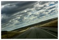
| 02/04/2006 04:35:13 PM |
Shaded by the Cloudsby SonifoComment: quite nice scenery, may be the land could be lighter, the ange works well. but though i hard try not to, i still feel it is off topic |
| Photographer found comment helpful. |
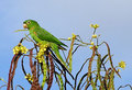
| 01/29/2006 09:05:49 AM |
Parrotby nereumComment: interesting and nice composition and colors, though the sharpness (focus?) could be better |
| Photographer found comment helpful. |
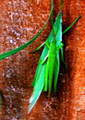
| 01/29/2006 08:53:45 AM |
Grasshopper.by harleyComment: sorry, i don't know whether it is resolution or compression or noise or all of it, but the grasshopper is almost unrecognisable. while colors seem nicely bright, the overall impression is spoiled by the lack of focus and the noise.
(added some interpunction)Message edited by author 2006-02-01 16:48:39. |
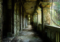
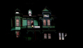
| 01/24/2006 03:52:14 PM |
Fantasy Withinby bcobleComment: seems a bit slanted and a bit too dark (is that daylight reflection the upper window?). And the lantern is redundant. On the other hand the tones and shapes of the visible part of the building are very pleasing. |
| Photographer found comment helpful. |
| 01/24/2006 01:32:40 PM |
|
| Photographer found comment helpful. |
Home -
Challenges -
Community -
League -
Photos -
Cameras -
Lenses -
Learn -
Help -
Terms of Use -
Privacy -
Top ^
DPChallenge, and website content and design, Copyright © 2001-2025 Challenging Technologies, LLC.
All digital photo copyrights belong to the photographers and may not be used without permission.
Current Server Time: 06/28/2025 02:48:22 AM EDT.