| Image |
Comment |
| 03/02/2008 07:34:06 AM |
|
 Photographer found comment helpful. Photographer found comment helpful. |
| 03/02/2008 07:32:33 AM |
Pastel Dreamsby chesireComment: Lovely! Lovely composition created from the shape of the flower and stem, your positioning of it on the surface and your choice of viewpoint. Lovely lighting. The dark and shiny backdrop complements the texture of the petal beautifully. And what wonderful colour and shape! |
| Photographer found comment helpful. |
| 03/01/2008 06:10:57 PM |
|
| 03/01/2008 06:09:57 PM |
Cherries and Red Wineby arpitaComment: Fine art! Just beautiful. The quality of light (and shadow) is just masterly here as is the simple composition and the fantastic effect of the shallow DOF on bottle and glass. I LOVE THIS. |
| Photographer found comment helpful. |
| 03/01/2008 06:09:01 PM |
It is at the edge of a petal that love waitsby NuzzerComment: Wow! That's gorgeous! And I love the difference in scale between that tiny caterpillar and the yellow petals. Lovely composition too - good choice not to go for the standard ROT positioning of the caterpillar. This works! |
| Photographer found comment helpful. |
| 03/01/2008 06:08:00 PM |
Mr Geckoby rinacComment: Lovely vivid greens and I like your composition and your choice of DOF to blur out some of the foreground and all of the background leaves. |
| Photographer found comment helpful. |
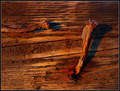
| 03/01/2008 06:07:31 PM |
|
| Photographer found comment helpful. |
| 03/01/2008 06:07:13 PM |
|
| Photographer found comment helpful. |
| 03/01/2008 06:06:41 PM |
Tarnishedby riversongComment: I really, really like the tarnished vertical backdrop. The variety of metals each with a subtly different colour, sheen and wear works really well. I like the composition too - giving the entire top half of the image over to that backdrop works well. |
| Photographer found comment helpful. |
| 03/01/2008 06:04:34 PM |
Spin Me 'Roundby nadiaCComment: I really like this a lot particularly the contrast between the smooth texture of the surface and the wooden, hand-coloured top. My only minor negative is that the pale stripe of the surface falls at the top right of the image because it kind of gets lost there and makes the background seem less complete, less rectangular. I think it would be worth having one of the stronger colours at the edges to make sure the edges are defined. |
| Photographer found comment helpful. |
Home -
Challenges -
Community -
League -
Photos -
Cameras -
Lenses -
Learn -
Help -
Terms of Use -
Privacy -
Top ^
DPChallenge, and website content and design, Copyright © 2001-2025 Challenging Technologies, LLC.
All digital photo copyrights belong to the photographers and may not be used without permission.
Current Server Time: 08/08/2025 01:04:43 PM EDT.