| Image |
Comment |
| 09/20/2002 11:39:00 AM |
Edisonby hokieComment: I imagine it was a deliberate decision to have the white glass of the bulb melt into the background but for me that means I am struggling to drawn in the lines of the bulb which my mind knows are there, and therefore getting annoyed at the negative space colour choice rather than enjoying it. I like the viewpoint on the bulb and the composition of the shot, but in my personal opinion, I am not keen on the white bleeding to white in this one. 6, Kavey |
| 09/18/2002 11:41:00 AM |
The Emptiness left behindby snoopyComment: Great impact in the colour of the flags and the repetitive nature of them. Building in back feels tilted. Doesn't match my interpretation of neg space though. I appreciate this is according to my own definitions of neg space and your mileage may vary. 4, Kavey |
| 09/18/2002 12:24:00 PM |
goodnight elizabethby SatelliteSpeckComment: Nice composition, personally I find it too blurry, though I appreciate that may be deliberate. I can't make sense of how she's lying, her back looks twisted. Colours feel too strongly saturated for me. 5, Kavey |
| 09/21/2002 12:55:00 PM |
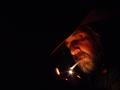
Burnin' Oneby LindaLeeComment: I love the way the blackness surrounds him and bleeds into the shadows of his face, hat and hands - the darkness really drives us in close to him - the way the light shows us his only his face and hand makes it very intimate. This wouldn't work with any other background. Feels like a shared moment in time. 10, Kavey |
 Photographer found comment helpful. Photographer found comment helpful. |
| 09/21/2002 10:53:00 AM |
|
| 09/20/2002 12:34:00 PM |
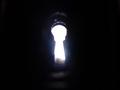
Keyholeby shutterflyComment: I'd like a clearer definition of the keyhole shape. Not sure what the little bubbly things are. I want to see through the keyhole. Just my preference though. 5, Kavey |
| 09/21/2002 12:17:00 PM |
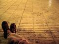
I don't care...by jcofComment: I like the scarrered matched etc around the floor and the colourcast. The lines of the tiles leading away are also really good. 7, Kavey |
| 09/18/2002 12:31:00 PM |
Head in the Cloudsby cmcvetyComment: I would like to see more of the man. Neg space to me doesnt mean object has to be dwarfed in the frame by the background. Like the upward looking angle. 5, Kavey |
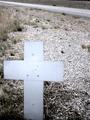
| 09/17/2002 03:26:00 PM |
Highway Fatalityby CLarson557Comment: Good composition but lacking in contrast between cross and background. Background is a little bland. I appreciate that perhaps this is about the negative space left behind by the person this cross commemorates. In my mind though the challenge is about visual not emotional negative space. 4, Kavey |
| 09/21/2002 12:05:00 PM |
Untititledby pnichollsComment: Such a simple composition and I think the branch combining with the bird really makes a great shape and anchors the bird within the frame. I like the DOF which throws the background out of focus and leaves just an impression of the greenery behind without including potentially distracting detail. Technically this shot is absolutely wonderful - content wise it doesn't truly excite me, but I am admiring it as I look at it again. 7, Kavey |
Home -
Challenges -
Community -
League -
Photos -
Cameras -
Lenses -
Learn -
Help -
Terms of Use -
Privacy -
Top ^
DPChallenge, and website content and design, Copyright © 2001-2025 Challenging Technologies, LLC.
All digital photo copyrights belong to the photographers and may not be used without permission.
Current Server Time: 08/17/2025 05:05:59 PM EDT.