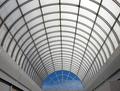
Cloudlife
by
xertionComment: Critique Club
Initial thoughts
Lovely symmetry and quality of light
Composition/ Content
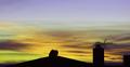
A beautiful and simple composition. I love the way it has symmetry from left to right but not from top to bottom.
The curving roof lines are beautiful and I particularly like the way the central �beam� cuts the image in half top to bottom.
The grey lines at the left and right lead the eye directly to the window itself.
The blues and clouds of the window are the focus of the image and all the lines serve to emphasise this.
Camera Work - Technical
Exposure is wonderful � I love the way you�ve got the blues and whites of the sky just right and yet also achieved that ethereal light through the ceiling itself.
Digital Processing - Technical
Can�t see any problems � all looks great to me.
Any negatives?
Not that you could have done a thing about this but I find the dark shadows beneath the grey coving on the left a bit distracting. Because the dark line they create is so much wider than the lines of interest my focus tends to be pulled to the left a little. In an ideal world there would be a second grey sheet covering this as there is on the right. As I said, I am mentioning this only to be complete in my own assessment � I appreciate fully that a) you couldn�t change this and b) the image is still absolutely wonderful and successful regardless.
Fits The Challenge
Very much so.
My Opinion On The Photo
I really like this. I enjoy looking at it. The curves, the blue sky and the ghostly quality of the light coming through the ceiling make it a very appealing image.
Message edited by author 2003-03-16 08:53:14.