| Image |
Comment |
| 05/01/2003 02:01:14 PM |
.by dsidwellComment: Cool idea and nicely done. Because of shorter length of text this balances a little better than the dpchallenge version. I am definitely not keen on choice of font.
6, Kavey |
 Photographer found comment helpful. Photographer found comment helpful. |
| 05/01/2003 02:00:26 PM |
Go ahead, take your best shot ... by TarbiniComment: I really like the message here - think it's cute, clever and tells what the site is about. I'd prefer a slightly different balance between the photo space and the text space. I think this would work best as a promotional postcard.
7, Kavey |
| Photographer found comment helpful. |
| 05/01/2003 01:58:13 PM |
|
| 05/01/2003 01:55:22 PM |
Challenge the Worldby websterComment: This would score a 5 or 6 from me in the other sticker challenge - but entered into the dcprints challenge I'm awarding a 4 because it doesn't mention the site name.
I really like the composition and colours though I don't like the font used.
Kavey |
| Photographer found comment helpful. |
| 05/01/2003 12:32:48 PM |
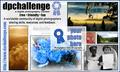
A Great Stickerby NicNic101Comment: Much much too cluttered. I can't read the text I need to read - the website name and what the site is about - but I can read the message that welcomes me to the garden. The resolution is also just too low and the pixelisation is severe.
Apologies, but it's only a 2 from me.
Kind Regards
Kavey |
| 05/01/2003 12:31:42 PM |
Your Mind's Eyeby alanfreedComment: I can see the idea and how it links to the chosen strapline but I just find it incredibly unappealing.
Apologies, but it's only a 3 from me.
Kind Regards
Kavey |
| Photographer found comment helpful. |
| 05/01/2003 12:30:47 PM |
dpc simple stick maine styleby kblmComment: As I\'m sure has been said already, spelling is a key issue and could simply have been copied from the site itself, if you were unsure.
Not keen on the font choice at all, I think using the official site logo font would have worked better.
Apologies, but it's only a 3 from me.
Kind Regards
Kavey |
| 05/01/2003 12:30:31 PM |
Your Photo Hereby GeneralEComment: This just feels much much much too busy to me - and I can\'t imagine it working on a sticker. I think simplicity works best for this kind of project and that less is more.
Love some of the individual photos - the two kids and the sunlit clouds are ones I\'ve admired on the site.
Apologies, but it's only a 3 from me.
Kind Regards
Kavey |
| Photographer found comment helpful. |
| 05/01/2003 12:30:15 PM |
|
| Photographer found comment helpful. |
| 05/01/2003 12:24:43 PM |
dpchallenge.com stickerby nathaliedooComment: Much too busy for me and the rectangle below doesn't feel like it belongs to the rest of the design.
Not a winner for me, but good luck!
Kind Regards
4, Kavey |
Home -
Challenges -
Community -
League -
Photos -
Cameras -
Lenses -
Learn -
Help -
Terms of Use -
Privacy -
Top ^
DPChallenge, and website content and design, Copyright © 2001-2025 Challenging Technologies, LLC.
All digital photo copyrights belong to the photographers and may not be used without permission.
Current Server Time: 08/25/2025 04:08:06 AM EDT.