| Image |
Comment |
| 07/11/2003 10:16:45 AM |
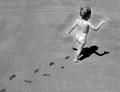
Free Spiritby SonifoComment: Not what one would think of for a nude but an excellent one, nonetheless!
I love the composition of this - that diagonal leading line of little wet footprints is both "darling" and compositionally/ graphically appealing. I also like the question it raises about where she is marching off to. Her wonderful pose makes for an interesting shadow shape too.
Only minor point -ve point I'd make is that there seem to be some highlights that are a little blown out on her botton, shoulders and back of her legs, though I can see that the natural light was quite strong.
I think this is a lovely lovely entry. |
 Photographer found comment helpful. Photographer found comment helpful. |
| 07/11/2003 10:09:59 AM |
Body Artby mbardeenComment: First thing that strikes me is the strong composition. I like the shapes formed by her crooked arm, body and the frame of the image. I like the way the main triangle of negative space is echoed by the triangular tattoo. I also like the way her hair merges into the darkness at the top right.
That said, I'm not sure about how much this says "nude" to me - given that one often sees this much skin just walking down the highstreet at this time of year (especially given current UK temperatures). If I could vote I wouldn't score down for that, it's just my impression, but I would say that this wouldn't strike me as "nude" if I saw it on another site, in another challenge.
Lastly, darkness: A tutor used to tell me, as I tried to work out whether I'd used a suitable exposure and contrast grade in the darkroom, to think about the white and black in the original scene I was portraying. If there were white highlights in the original then I should see some white in my print. If there were solid black areas in the original scene, I should see those in the print also. This is assuming I the scene was lit as I intended and I had successfully captured that on my negative. In this image, I assume I'm looking at a caucasian model, yet her skin seems rather grey to me. That said, maybe she has a slight tan or a darker natural skintone? Personally I'd prefer this to be a touch lighter over her arm and hand and shoulder blade areas, though it's about right at her neck.
Sorry for rambling...
:D |
| Photographer found comment helpful. |
| 07/09/2003 07:26:22 AM |
|
| 07/09/2003 05:59:00 AM |
Untitledby lionelmComment: An image that would stand alone and that I can picture in a gallery of related images or on an arty greetings card.
Really makes me think about many things but the questions that pop up are probably different for each viewer.
Both visually and conceptually interesting. |
| Photographer found comment helpful. |
| 07/09/2003 05:57:49 AM |
|
| Photographer found comment helpful. |
| 07/09/2003 05:56:40 AM |
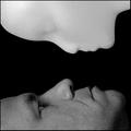
. . . About me?by dsidwellComment: Well captured concept - eye contact from listener really supports the theme as suggested by your title.
Contrast is set too high for my preference - I am not keen on the way the facial highlights have blown out to white. |
| Photographer found comment helpful. |
| 07/09/2003 05:55:22 AM |
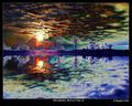
Zero spot editing. How? by kiwinessComment: Underwater I am assuming - I take it that's a finger holding the base of the glass at the surface of the water and tipping it to allow the trapped air out?
Great idea and wonderful colours.
Not so keen on the line dissecting the lower area - perhaps better if it were a true horizontal.
Lovely light in the bubbles. |
| Photographer found comment helpful. |
| 07/09/2003 05:53:14 AM |
Unanswered Questions?by dacrazyrnComment: Forgive me if this offends - it's meant in light-hearted jest.
I think I know what the unanswered question is here?
Missing Link between modern man and our ancestors found alive and well?
(It was the hairiness that set me thinking along those lines!)
Visually the light and shadow seem too bright and too dark respectively (for my tastes). Composition works very well for me though. I like the X shape that is formed with arms and legs.
|
| Photographer found comment helpful. |
| 07/07/2003 06:41:34 PM |
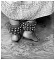
With Bells Onby friscaComment: Hey I just found this - this is GREAT!
I am torn between loving it in B/W and thinking how much colour there would also be - Indian high colour and glitz darling! Though don't think the carpet would "go" if it were in colour!
This is a great shot! |
| Photographer found comment helpful. |
| 07/07/2003 11:59:56 AM |
Hand on my heartby KaveyComment: Thanks Anna for your critique. Won't be entering the nude challenge as I'm not yet ready to become a paying member of DPC, but I hope similar challenge themes may be set again in the future.
The grain was not deliberate - I think it was because light may have been too low but I'm not experienced with the camera so I don't know.
I see what you mean about the strong light at the lower right area.
Thanks again. |
Home -
Challenges -
Community -
League -
Photos -
Cameras -
Lenses -
Learn -
Help -
Terms of Use -
Privacy -
Top ^
DPChallenge, and website content and design, Copyright © 2001-2025 Challenging Technologies, LLC.
All digital photo copyrights belong to the photographers and may not be used without permission.
Current Server Time: 08/26/2025 10:59:40 AM EDT.