| Image |
Comment |
| 08/11/2003 11:59:35 AM |
Lacey's Viewpointby giseleComment: A sweet picture and wonderful idea which would be immeasurably stronger, I think, if her eyes were visible. Instead I can see only black shadow and I really really want that eye contact - it seems to be the essence of the image! |
| 08/11/2003 11:57:32 AM |
Only One Thing on His Mindby kosmikkreeperComment: Ha ha ha - this one really made me think - first I was thinking "oh but that doesn't look like eyelashes, it looks more like a zip" - then it was "OH a ZIP!" - and it clicked that the image was from the point of view of a one eyed snake looking out of the flies! Very witty, somewhat riske, and clever framing and composition. I think this is a strong entry! |
 Photographer found comment helpful. Photographer found comment helpful. |
| 08/11/2003 11:55:10 AM |
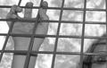
Holding on to Childhoodby rll07Comment: I like this idea a lot, though composition doesn't quite grab me as strongly as it might. I wonder if the bars were either exactly horizontal/ vertical or much more on the diagonal whether it would improve impact for me? I do like the way you've chosen to crop tightly to include only one hand and part of the face. |
| 08/11/2003 11:48:43 AM |
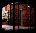
Old City Center Breezewayby shareinncComment: I like the framing concept here - the shape of the gate opening is appealing. However, IMHO, the view through is less appealing though and somewhat dark. |
| 08/11/2003 11:46:47 AM |
|
| Photographer found comment helpful. |
| 08/07/2003 12:15:59 PM |
Thursday 14th August 2003 by robsmithComment: Oooh he he he... It's like when you go to the hairdressers and sit in front of the mirror and there's another one behind you and you get that endless mirror thing going on...
Skin tones are way too red and blue seems too blue - is the saturation pumped up high?
Cute idea! Dream on! :-P :o) |
| Photographer found comment helpful. |
| 08/07/2003 11:46:38 AM |
"Jill"by robsmithComment: Lots of nice RAs and the close crop is a good idea in terms of making this a little more abstract and in strengthening composition. I like the diagonal from top right to lower left. That said the content just doesn't excite me visually very much. |
| 08/07/2003 11:44:56 AM |
Collectionby zerocusaComment: Nice idea and I like the shallow DOF. Also like the b/w choice. Composition is interesting but just too centred for my preferences. |
| Photographer found comment helpful. |
| 08/07/2003 11:08:52 AM |
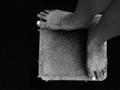
2 Feet Squaredby ellamayComment: Oooh I like this. What a strange and enigmatic picture! Even the actual feet have character of their own. Quirky and interesting! |
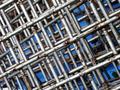
| 08/07/2003 11:07:53 AM |
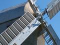
90 in wireby macoxComment: Though I think it needs a focal point I do like the texture, the colours of sky, metal and rust and the busy repetition of pattern. |
Home -
Challenges -
Community -
League -
Photos -
Cameras -
Lenses -
Learn -
Help -
Terms of Use -
Privacy -
Top ^
DPChallenge, and website content and design, Copyright © 2001-2025 Challenging Technologies, LLC.
All digital photo copyrights belong to the photographers and may not be used without permission.
Current Server Time: 08/26/2025 06:01:40 PM EDT.