| Image |
Comment |
| 07/13/2004 04:05:37 PM |
She's Goneby moviemanComment: This doesn't so much say Freedom as it does Loss to me. Love your use of shallow DOF and I like your composition too. Black and white works well for the subject matter. 7 |
 Photographer found comment helpful. Photographer found comment helpful. |
| 07/13/2004 04:04:52 PM |
Defying Gravityby RiderGalComment: Great example of the challenge theme. Whilst background isn't hugely distracting I think a plainer one or a more blurred one would work even better. 8 |
| Photographer found comment helpful. |
| 07/13/2004 04:03:59 PM |
I'm free!by dr rickComment: Strong link to challenge theme - if I were to show people this image without mentioning the challenge theme I'm sure the word "freedom" would pop up. 8 |
| Photographer found comment helpful. |
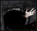
| 07/13/2004 04:03:07 PM |
Gaining Freedomby mocabelaComment: What an intriguing image. Very unusual, lots of texture and interest, makes me wonder where she's coming from, how she got there etc. 8 |
| Photographer found comment helpful. |
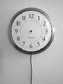
| 07/13/2004 04:02:22 PM |
.by David.CComment: I love this idea and it conveys the challenge theme to me perfectly. It could be improved by placing the clock on a coloured background or even on a non textured background and by use of softer, more even lighting. 8 |
| Photographer found comment helpful. |
| 07/13/2004 04:01:29 PM |
Freedom Flight by marboComment: The strongly saturated colours work well in this image as does the unusual viewpoint and composition. This is one of my two top images for this challenge as it conveys the challenge theme very strongly within the image. 9 |
| Photographer found comment helpful. |
| 07/13/2004 04:00:17 PM |
Free spirit by heidaComment: Beautiful muted sky and sea colours - very calming. The pose, with arms flung casually out, is very much what conveys the challenge theme to me in this image. Composition is just right. 9 |
| Photographer found comment helpful. |
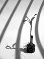
| 07/09/2004 11:56:51 AM |
Sunbathby TiberiusComment: The lighting of the background is great - I really like the graphic element those curved shadows provide. Placement of subject within frame is good - and it balances well with it's own shadow. Focus seems poor - the detail on the leaves, pot, roots etc just isn't sharp. Could also do with bouncing just a touch of light back onto the near side of the plant to make it easier to see that detail. |
| Photographer found comment helpful. |
| 07/09/2004 05:11:29 AM |
Hostageby BeagleboyComment: Excellent image and great CC critique from graphicfunk - spot on! |
| Photographer found comment helpful. |
| 07/04/2004 05:17:33 PM |
Excuse Me Sir...by KonadorComment: Too funny...
But doesn't take too much imagination to work out where this idea really came from? Nudge nudge wink wink! |
| Photographer found comment helpful. |
Home -
Challenges -
Community -
League -
Photos -
Cameras -
Lenses -
Learn -
Help -
Terms of Use -
Privacy -
Top ^
DPChallenge, and website content and design, Copyright © 2001-2025 Challenging Technologies, LLC.
All digital photo copyrights belong to the photographers and may not be used without permission.
Current Server Time: 09/04/2025 11:57:40 AM EDT.