| Image |
Comment |
| 08/03/2004 05:48:41 PM |
smoke.jpgby PedroComment: This is beautiful! I love the shallow DOF that throws the face out of focus so it almost becomes part of the background but not quite. The lighting on the smoke is wonderfully vivid.
Is it taken through a dirty window? There are strange dirty "spots". |
 Photographer found comment helpful. Photographer found comment helpful. |
| 08/02/2004 09:28:13 AM |
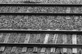
North and South Linesby NelzieComment: You have asked how someone might better convey the concept of "opposites" in this image. I think the answer might be that you couldn't really do so and that the subject is therefore a poor choice for the challenge. I think most of the low scores probably centre on that rather than on the image itself. That said I'll comment on the image next and ignore it's suitability for this particular challenge theme.
Texture: You have captured some lovely textures including the worn wooden sleepers, the gravel and the reflective metal. That contrast of textures is definitely a point of interest.
Contrast/ Tone: The image overall is quite dark. Contrast is reasonably high which works well - I can see the whole range of greys from almost pure white to black shadows.
Composition/ Content: The rails are not horizontal within the frame and the tilt is quite obvious because of the proximity of the lines to the edges of the frame. Rotation would help. The image seems a little too centred horizontally - if there is an expanse of gravel above the top rail I'd include a lot more so that the two rails shown sit in the lower two thirds of the frame. There isn't really an individual focal point or single point of interest - although that's not always necessary, I think it might lift this image and add further interest. For a surreal touch you might place an unexpected object such as a toy rubber duck. For a more traditional feel perhaps a worker's hat and gloves, as though abandoned or maybe a tool?
|
| Photographer found comment helpful. |
| 08/02/2004 09:19:34 AM |
It's Monumentally Refreshing!by NelzieComment: Kavey Critique
Initial thoughts
Viewpoint is unusual but overall image seems very tilted.
Composition/ Content
As above, the tilt does make this look less professional and could have been corrected with a small rotation of the image followed by a crop. The colours are vivid which is appealing and the water droplets do add interest but there isn't really a focal point for me - where should my eye end up?
Background
I like that it's not completely flat yet doesn't distract from the subject.
Technical
Lighting seems harsh - perhaps diffusing the light source with a white cloth or tissue might help.
Fits The Challenge
Yes, though it seems more a case of showing me the product than really selling it's qualities.
My Opinion On The Photo
An acceptable image but one that could be improved a great deal by a few simple changes to lighting and rotation. That said, content does lack "punch".
|
| Photographer found comment helpful. |
| 07/28/2004 05:55:31 AM |
|
| 07/27/2004 05:06:21 PM |
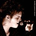
Deathly Passion Cabaretby KonadorComment: Excellent capture of emotion, concentration, enjoyment of a performer. Lighting adds mood well and text is nicely subtle. 8 |
| Photographer found comment helpful. |
| 07/27/2004 03:49:57 PM |
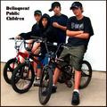
Delinquent Public Childrenby bobdaveantComment: Nice idea. The choice of location is excellent as the ground and background seem very clean and offer no distractions. I find the cropping is a little too close to the subjects heads, feet and wheels for my tastes. 7 |
| Photographer found comment helpful. |
| 07/27/2004 03:40:35 PM |
Desert Preservation Companyby BradComment: Nice simple shot which is almost abstract in feel. Interesting choice of font for "moonglow" - not sure I like it. The white font at the top works well. 7 |
| Photographer found comment helpful. |
| 07/27/2004 03:39:31 PM |
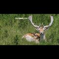
Deer Park Crewby TiNComment: Like the use of the "wide screen film" black bars. Really adds an extra dimension to this. Text design works very well. 9 |
| 07/27/2004 03:39:04 PM |
|
| Photographer found comment helpful. |
| 07/27/2004 03:38:31 PM |
|
Home -
Challenges -
Community -
League -
Photos -
Cameras -
Lenses -
Learn -
Help -
Terms of Use -
Privacy -
Top ^
DPChallenge, and website content and design, Copyright © 2001-2025 Challenging Technologies, LLC.
All digital photo copyrights belong to the photographers and may not be used without permission.
Current Server Time: 09/02/2025 02:38:01 AM EDT.