| Image |
Comment |
| 08/04/2004 10:57:57 AM |
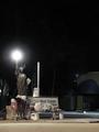
Beacon of Hope?by muur88Comment: This is an image full of sadness - the statue of "liberty" looking down on a street person who finds that his freedom comes with a dose of indifference from the rest of society. Although I can understand the reason for the use of negative space to amplify his solitude I am frustrated that I cannot see the detail that intrigues me. 7 |
 Photographer found comment helpful. Photographer found comment helpful. |
| 08/04/2004 10:55:07 AM |
|
| Photographer found comment helpful. |
| 08/04/2004 10:54:42 AM |
"Just a Little...."by tfarrell23Comment: Either needs to be properly vertical or rotated much more. As it stands it just appears to be accidentally tilted. Otherwise I quite like it. 6 |
| Photographer found comment helpful. |
| 08/04/2004 10:54:02 AM |
Catch upby k4ffyComment: A somewhat surreal image, not least because the tomatoes aren't (or don't appear to be) real. Nice use of shallow DOF. Not sure what they are sitting on but I think a plainer surface would work better here. 6 |
| Photographer found comment helpful. |
| 08/04/2004 10:52:36 AM |
Take a Chanceby kyeboshComment: Lighting is poor and focus seems soft. Nice idea in terms of showing scale. Because the middle dice sticks out to the left I think the pile would be better positioned towards lower right rather than lower left of the frame, with lighting correspondingly moved to throw shadows towards the left instead of the right. Alternatively reposition die so that middle one is towards right not left of white one. 6 |
| Photographer found comment helpful. |
| 08/04/2004 10:48:02 AM |
Frying an egg (in a miniature pan)by GinaRothfelsComment: I like the repetition of curves in the mould and griddle but the white curve at the top is cropped too much to add anything yet sufficiently obvious to detract. White surface is also dirty which is definitely not appealing. 6 |
| Photographer found comment helpful. |
| 08/04/2004 10:46:40 AM |
Riceby PhileineComment: Nice idea of "cargo" to show scale but loses out because of poor background. The background is dirty and really shows reflections that have nothing to do with your image. This idea needs further development to make it more striking - what about non-plain backgrounds? 6 |
| Photographer found comment helpful. |
| 08/04/2004 10:43:06 AM |
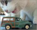
Land of the Giantsby trainComment: This shows the scale beautifully but too much of the cat is just a blur of motion to me. I like motion blur when it adds something to the image but here I think crisp focus would work better. I'd also suggest a plain background to eliminate all that detail behind the cat at the left of the frame. 6 but would have been higher with better focus and background. |
| 08/04/2004 05:22:22 AM |
Just an ornamentby yael27Comment: Beauitiful detail and presented so well. Composition works well with horizontal curves of the rim and lid against the more vertical curves of the strings. Colour and lighting work well, border is nicely done. 9 |
| Photographer found comment helpful. |
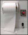
| 08/04/2004 05:18:49 AM |
A Commodius Placeby lwkimagesComment: Perfect composition with miniature photo frame and toilet and also fold of toilet tissue on the flat surface. Great surreal feel. 9 |
| Photographer found comment helpful. |
Home -
Challenges -
Community -
League -
Photos -
Cameras -
Lenses -
Learn -
Help -
Terms of Use -
Privacy -
Top ^
DPChallenge, and website content and design, Copyright © 2001-2025 Challenging Technologies, LLC.
All digital photo copyrights belong to the photographers and may not be used without permission.
Current Server Time: 09/01/2025 11:03:22 PM EDT.