| Image |
Comment |
| 06/08/2005 01:31:41 PM |
to be or not to be...by christie3Comment: I am commenting on this image in a reaction against the attempt by some to limit the content of DPC to images that conform to their idea of acceptable.
I can understand what you are trying to show in this image but think that, without the title, it's incredibly ambiguous. It's only with the title that one can just about make the inference that the bandage covers wrists that have been cut as opposed to a sprained wrist or the like. I also find the image much too dark. Whilst use of shadows and limited light can help create a certain mood, in this case it just makes it hard to distinguish the content and doesn't work for me. |
 Photographer found comment helpful. Photographer found comment helpful. |
| 06/08/2005 01:29:17 PM |
When my Life is Falling Apart.. Should I? Or Shouldn't I?by RaiNb0wGiRliE2Comment: I am commenting on this image in a reaction against the attempt by some to limit the content of DPC to images that conform to their idea of acceptable.
I like what you're trying to show here but, for me, this doesn't convey the idea of decision very well, even with the title. It does convey many things successfully however - the anguish of needing to self-harm in order to feel or control, the loneliness of others not knowing or understanding. In terms of the image itself, I find the colour balance a bit too red/ yellow. I also don't like the way the hand and razor are positioned over the drain - the shapes interfere with each other. The razor is too much in shadow to stand out as a focal point too. The brightest point is instead the drain behind. I like the personal viewpoint, it's clever to place the camera where the cutter's own eyes must be. |
| 06/06/2005 12:54:48 PM |
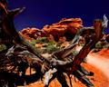
gnarledby fstopopenComment: Strikes me as very oversaturated in terms of colour and also too high in contrast. And the sky seems too dark a blue - did you use a polarizer? Nice viewpoint but not well presented to my eyes. |
| Photographer found comment helpful. |
| 06/06/2005 12:52:48 PM |
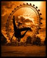
Viewpoints by ImagineerComment: Excellent idea and superbly captured. I really dislike the orange toning - a true black and white or a more subtle toning would have appealed more to me and upped my vote. |
| Photographer found comment helpful. |
| 06/06/2005 12:45:13 PM |
|
| Photographer found comment helpful. |
| 06/06/2005 12:41:06 PM |
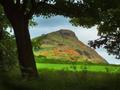
Lion's Headby bpickardComment: Horizon seems tilted. A little too much darkness included at left for my preferences. Colours seem a touch too saturated too. Nice subject choice. |
| Photographer found comment helpful. |
| 06/06/2005 12:37:25 PM |
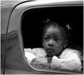
Rear window.by PixelstateComment: I recognise this... I think! Nicely captured candid but... overall seems quite dark and yet there is blow out on the whites of the cardigan sleeve. Beautiful expression though. |
| Photographer found comment helpful. |
| 05/31/2005 05:27:21 PM |
Early morning Blues by XileboComment: A lovely capture of the motion of these beautiful animals but, as a viewer, I cannot help but be disappointed by the inclusion of the concrete fence behind them. |
| Photographer found comment helpful. |
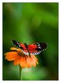
| 05/31/2005 05:26:17 PM |
Nature's Paletteby gaurawaComment: Nice contrast of foreground object colours to background colours. Background also blurred to just the right extent. |
| Photographer found comment helpful. |
| 05/31/2005 05:25:24 PM |
Prideby ergoComment: Nice image, nice composition, like the pose too - it really reflects the title well. Focus seems somewhat soft to me though. |
| Photographer found comment helpful. |
Home -
Challenges -
Community -
League -
Photos -
Cameras -
Lenses -
Learn -
Help -
Terms of Use -
Privacy -
Top ^
DPChallenge, and website content and design, Copyright © 2001-2025 Challenging Technologies, LLC.
All digital photo copyrights belong to the photographers and may not be used without permission.
Current Server Time: 08/26/2025 10:25:22 AM EDT.