| Image |
Comment |
| 07/14/2005 03:48:21 AM |
Cactus Jackby tfaustComment: B/W Mentor Group.
I think the subject matter here is great. The toned black and white goes well with the subject matter too. Exposure wise, I think it's a shame that the very strong light makes his shirt more of a focal point than his face, hidden in shadow, which is what I'd like to see more of. I appreciate this is probably a quick grab shot (after asking) so you could hardly spend time asking him to turn this way and that depending on position of the sun nor use a reflector to get more light to his face. |
 Photographer found comment helpful. Photographer found comment helpful. |
| 07/14/2005 03:45:39 AM |
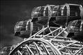
spacepods.jpgby FalcComment: B/W Mentor Group.
This is a nice study of the London Eye pods and I like the high contrast black and white treatment. I find the sky a touch too dark - is that down to a polarising filter? Message edited by author 2005-07-14 03:48:45. |
| 07/11/2005 04:17:08 PM |
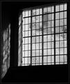
Old Panesby KaveyComment: Oh my goodness, Elvia, I can SEE HIM!!!
To answer some questions:
The white area to the left side of what one sees through the pane is the outside half of the very, very thick wall that this window is in. I don't think it's blown out (though I may be wrong) so much as the fact that it is one of the palest areas within the image. It's one of the points I like least about the shot.
The reflection on the interior wall to the left is the whole of the reflection, I haven't cropped any out, it reflects the thickness of the wall. Just outside of frame to the left is a 90 degree corner turning into the interior wall of the chapel.
What one can see through the window are various buildings that form part of the naval college estate. |
| 07/11/2005 04:12:23 PM |
Asian Lilyby admart01Comment: B/w Mentor Group.
A lovely object to photograph and has a striking enough form to work well in black and white. Though I do like high contrast black and whites I am not sure that treatment enhances this photograph and the larger very white areas add a harshness rather than a softness, for me. Message edited by author 2005-07-11 16:12:37. |
| Photographer found comment helpful. |
| 07/11/2005 04:10:55 PM |
Mother and Daughterby admart01Comment: B/W Mentor Group.
This is such a beautiful study, very intimate and full of emotion. I love the high contrast black and white - it works well to really show the textures in the younger and older skin and I like the way the lighting really brings out every contour. I am not really sure about the large empty area to the right - it doesn't strike me as an image that benefits from that negative space. I'm also not keen on the selective desaturation here as it puts the focus on the ring rather than the relationship between the owners of the two hands (since it's fairly clear the ring isn't about the bond between these two individuals). |
| Photographer found comment helpful. |
| 07/11/2005 10:48:39 AM |
It just breaks your heart....by TruegshtComment: B/W Mentor Group.
Here are my observations in no particular order:
- Focus is on the wooden pole infront of the child rather than on the child. This is a big point for me and definitely is the one thing thta stands out most strongly.
- Does the pole have significance to the image contents? If not I'd suggest excluding it.
- The image overall is quite dark though you do have some natural highlights so it's not wrongly exposed - I don't know if this darkness is deliberate but it doesn't draw me in - perhaps throwing a touch more light onto the child's face might make it more attention grabbing?
- Eye contact is good - that provides a connection between subject and viewer.
|
| Photographer found comment helpful. |
| 07/11/2005 10:14:48 AM |
Intimate Settingby aboutimageComment: B/W Mentor Group.
This is an unusual shot and I think it lends itself well to black and white. Here are my observations, in no particular order:
- The toning applied to the black and white seems rather red in colour, this may be deliberate to echo the colour of the wine.
- Although there are some really bright white areas outside the window, because there are a lot of highlights in the foreground objects this doesn't stand out or distract particularly.
- I like the way the objects are placed to one side to allow the view of the window grills but I find their placement somewhat cluttered.
- I wonder if more could be made of the reflections of the objects in the surface material?
- It's hard to focus on the shapes and outline of the flowers and leaves because of the strong shapes of the grill just behind.
- I like the detail in the glass of the objects and the reflections in the wine glass are particularly intriguing.
- I like the way the bottom left hand corner is punctuated by a full circle from the grill. I think the slight cropping make the one at the top left less effective. Message edited by author 2005-07-11 10:44:40. |
| Photographer found comment helpful. |
| 07/11/2005 09:39:54 AM |
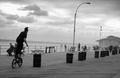
coney island slalomby muckpondComment: B/W Mentor Group.
There are some aspects of this that leap out at me even before I am able to really soak in the broader scene and look hard at all the details:-
Tilted horizon - I can see how you've decided to keep the lines of the foreground area of the decking horizontal but as this is at the expense of the true horizon it doesn't work for me. Especially as all the verticals (lamp posts, bins and buildings) are also tilted.
Exposure - I also have a problem exposing for bright skies and often have the same situation as you have here with small patches of the sky completely blown out. In this image there are few natural highlights so those blown out patches really stand out more strongly.
Moving past those into the details of the scene, here are my observations:-
Our main character in the foreground seems to present a fascinating silhouette but this is interrupted by the two characters seated behind merging into his shape. I wonder what the composition would be like were the photograph taken a few moments later when he had progressed to a position between the two leftmost bins? Message edited by author 2005-07-11 10:44:11. |
| 07/11/2005 07:10:04 AM |
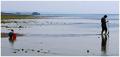
Rockpooling with dadby PixelstateComment: A sweet scene that is universal enough to remind many of our childhoods in the bosom of our families - many entries don't have what I'd term universal appeal - this one does I think. |
| Photographer found comment helpful. |
| 07/11/2005 07:08:53 AM |
Water Sprinkler on a Hot Dayby JamesterComment: Lovely compositional tool - the lines of the water and they add a great partial frame whilst also being a key part of the subject matter. This perhaps speaks more to me of "childhood" than "family" as an evident theme but it's all down to personal interpretation. Nicely done! |
| Photographer found comment helpful. |
Home -
Challenges -
Community -
League -
Photos -
Cameras -
Lenses -
Learn -
Help -
Terms of Use -
Privacy -
Top ^
DPChallenge, and website content and design, Copyright © 2001-2025 Challenging Technologies, LLC.
All digital photo copyrights belong to the photographers and may not be used without permission.
Current Server Time: 08/25/2025 02:10:57 PM EDT.