| Image |
Comment |
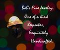
| 04/28/2005 11:30:32 AM |
Beauty Jewel...by sfarrell23Comment: Text is very intrusive; a bit too big. Diamond should have receive more light to have some sparkle. They look dull. |
 Photographer found comment helpful. Photographer found comment helpful. |
| 04/28/2005 11:28:58 AM |
The natural stoneby lastefComment: There has to to be a better way of showing a nice stone that on a flat black background. |
| Photographer found comment helpful. |
| 04/28/2005 11:24:44 AM |
|
| Photographer found comment helpful. |
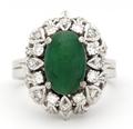
| 04/28/2005 11:07:42 AM |
Imperial Jade with Diamonds on White Gold Bandby dsb_macComment: Seems you were working with a very shallow DOF; there's an area around the ring that looks out of focus. Also, ligthing was maybe too direct. The sparkle of most of the diamonds is too intense and wash out the diamonds details. |
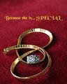
| 04/28/2005 11:04:18 AM |
Because You LOVE herby RayEthierComment: I think the use of shallow DOF (which I really like) is generaly not a good idea for especially jewelry advertisement theme. I think the more detail of the jewelry, the better. It would have been better if the area just behind the ring was in focus. The choice of text font and color is debatable. |
| Photographer found comment helpful. |
| 04/28/2005 10:59:34 AM |
The Gameby mpembertonComment: Jewelry seems like an afterthougth in tis picture. Lighting is uneven from front to back. Rings are very static in the composition. |
| Photographer found comment helpful. |
| 04/28/2005 10:57:36 AM |
|
| Photographer found comment helpful. |
| 04/28/2005 10:56:19 AM |
|
| Photographer found comment helpful. |
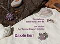
| 04/28/2005 10:55:19 AM |
Summer Dreamsby BeetleComment: Nice concept, but too much thing going on in this picture. I had to look for the jewelry. |
| Photographer found comment helpful. |
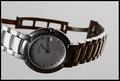
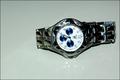
| 04/28/2005 10:51:45 AM |
on sale 1,000by gtp1164Comment: Rotating the watch would have make the composition better. Seems that direct lighting was used which blow out detail on the dial and creates dark area like right side wrist band. |
Home -
Challenges -
Community -
League -
Photos -
Cameras -
Lenses -
Learn -
Help -
Terms of Use -
Privacy -
Top ^
DPChallenge, and website content and design, Copyright © 2001-2025 Challenging Technologies, LLC.
All digital photo copyrights belong to the photographers and may not be used without permission.
Current Server Time: 08/15/2025 11:19:03 AM EDT.