| Image |
Comment |
| 01/20/2005 04:54:31 AM |
Welcome!by tolovemoonComment: It looks like it may be a funeral home, in which case the title is cheeky. Not a very appealing view of a spectacularly bland building. Sorry. 4. |
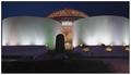
| 01/20/2005 04:51:59 AM |
Perlan by Nightfallby GautiComment: Iceland's marine fuel oil reservoir complex? This is a visually striking photograph. I hope, for the sake of the architect, that this particular view of the building does not show it to its best advantage. If this IS its good side, then all I can say is the lighting is quite nice. 6. |
 Photographer found comment helpful. Photographer found comment helpful. |
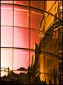
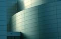
| 01/20/2005 04:45:22 AM |
Empiresby ImagineerComment: Reflected architectural scenes are hard to resist, for photographers and their veiwers. I guess I'm saying that it's not awfully original. This is a good one, however, with a very good title as well. 6. |
| Photographer found comment helpful. |
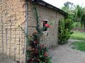
| 01/20/2005 04:41:39 AM |
Stick & Adobeby BudComment: A very interesting subject, but I think your treatment of it is more revealing of its construction than its architecture. But a nice enough photo. 5 |
| Photographer found comment helpful. |
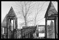
| 01/20/2005 04:39:02 AM |
The Winter Funhouseby smoon273Comment: Well I suppose it is architecture, but I'm afraid if it is, it is not a very interesting structure, and nor is it a very interesting photograph of it. The straight-on perspective does nothing to create a bit of interest. Sorry. 3. |
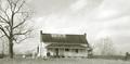
| 01/20/2005 03:18:12 AM |
Country Homeby cicisunflowerComment: This is an attractive image. I'm glad you didn't kill it with excessive post-camera processing. This small, quiet & calm house may not be the most dramatic architectural achievement, but it fits its environment, & your photo and treatment fits the house. 7. |
| Photographer found comment helpful. |
| 01/20/2005 03:12:24 AM |
The Metropolitan Museum of Artby HomunculusComment: This is an interesting composition, which shows off the architectural detail very well. You probably had no choice but to crop at this point anyway, but it's effective. I'd have tried a tiny bit more contrast, to better define the depth of the scene (it seems a little two-dimensional), but maybe you did try that & preferred it this way? 6. |
| 01/20/2005 03:07:52 AM |
Under the Gold Domeby elemessComment: Looks familiar but with no star. The photo appears a bit overblown in the highlights, but I think you had to make the most of the spectacular halo of light, which gives this image its impact. 6. |
| Photographer found comment helpful. |
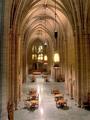
| 01/20/2005 02:53:50 AM |
Study Hallby alanfreedComment: What would you study here; celestial mechanics? It is impressive architecture, that's for sure, and your photograph is a good one. But the tables & chairs do seem to trivialise this massive hall a bit. 6. |
| Photographer found comment helpful. |
| 01/20/2005 02:49:44 AM |
Air and Spaceby MrYuComment: Beautiful lighting. That's probably really a tribute to the architect, but you understood what was there and how to capture it. 7. |
| Photographer found comment helpful. |
Home -
Challenges -
Community -
League -
Photos -
Cameras -
Lenses -
Learn -
Help -
Terms of Use -
Privacy -
Top ^
DPChallenge, and website content and design, Copyright © 2001-2025 Challenging Technologies, LLC.
All digital photo copyrights belong to the photographers and may not be used without permission.
Current Server Time: 08/04/2025 06:04:17 PM EDT.