|
|
|
Showing 3321 - 3330 of ~4143 |
| Image |
Comment |
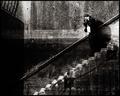
| 09/21/2005 05:12:54 AM | Staircase Descending to Fish Pond by Keith ManiacComment: Hey Chris - sorry for all the bizarre duplications ... I'd been trying unsuccessfully to post when the site was acting up, and didn't realise all my attempts were being queued up like that. Hopefully someone (D&L?) might rescue me & delete all the superfluous edited posts below. P. |  Photographer found comment helpful. Photographer found comment helpful. |
| 09/21/2005 01:39:23 AM | Staircase Descending to Fish Pondby Keith ManiacComment: Oh no, not you again? That's twice in a month, Chris. Voters here must be doing an awful lot of late night drinking.
It's brilliant. Truly one of the best images on the site, and a great addition to your portfolio. It's also a welcome relief (and surprise) to see such a cerebral work score so well. I didn't comment during voting because I didn't vote, or even look. 536 entries!
The composition is terrific ... hints of MC Escher, but with a whiff of zen! The white fish is a master stroke ... how you got the little bugger to hold perfect position right there is beyond me. Nails?
Probably the most impressive aspect is the crop ... I know that awesome little lens screwed down to 10mm made it possible, but the crop is nevertheless absolutely audacious and a great tribute to your vision. There! Enough sycophancy ... I'm off for a late night drink.
| | Photographer found comment helpful. |
| 09/19/2005 04:36:44 AM | Juniorby mesmerajComment: Don't complain, Elli. Submit stuff like this & very few people will tolerate it. Your work is usually balanced on the edge of reason, so it's not surprising that for many viewers much of it topples over to the 'wrong' side! Still my equal favourite. |
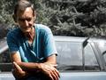
| 09/18/2005 09:34:19 PM | One Branch To Bind Them Allby JaimesonComment: Greetings from the Critique Club!
Not everyone understood this bit of sharp social commentary, but I'm sure you had expected that.
You are taking the position that availability of abundant power both serves and enslaves us, in much the same way as does the One Ring alluded to in your title. And you use the ubiquitious power pole as a visual symbol of the extent to which this technology inevitably intrudes into our lives; it even dominates your view from your own home!
I therefore join those few voters who did recognise and applaud your cerebral approach to the challenge ... it's creative and original. And I suppose one could say there's a 'Branch" theme in the image, even without the title.
Some commentators said the border sucks, or they weren't totally impressed with some other technical aspect of the image. They're probably right, too ... the border does seem pointless, and the image is harsh and unlovely (I know; it's deliberately so).
Finally there's the larger group of people who didn't bother to comment at all, including me; just gave you a 4 or 5 and moved on. Why? I guess because your image is easy to dismiss without thought .. sort of "Power pole? Yeah, yeah, so what?"
So, finally we get to the point of the critique: Are you justified in submitting an unlovely image because you're making a deeper point, an artistic point? Yep. Is it therefore good photography? Yep. Is it going to appeal to lots of voters here? Nope.
Alas, I haven't taught you anything you didn't already know. However, keep doing what you do, Jaime!
Cheers,
Paul Martin | | Photographer found comment helpful. |
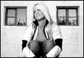
| 09/17/2005 09:38:47 AM | Thinkingby andrimComment: Greetings from the Critique Club, Andri.
There's no doubt that you have produced a high contrast image, even though that was not your intention when actually shooting it. So I think there are two other aspects of the image to discuss.
First, the centred composition. As you predicted in your comments above, some voters did not like the centering and some did. My view is that slavishly following the 'rule of thirds' is just like slavishly following any other rule ... it's boring and it kills originality (I can't help thinking of your strange but undeniably original fellow Icelander; Bjork). However, the rule of thirds does work, so if you are going to depart from it, there should be a good reason. And in this case I think you have one; the two almost identical windows, with their similar reflections, make an unusual and interesting bracket around your model.
And that leads to the second discussion point; interest. The model is doing nothing in this shot. She's just squatting and looking off to the side in a vaguely distracted and passive manner. She's pretty, but that in itself isn't enough to create a high level of interest for the viewer. So if the subject doesn't stimulate the viewer's imagination, curiosity or emotions, then something else has to. Which is why I think you were right to use the more challenging centred composition ... it establishes something for the viewer to think about, even if it's just to consider how the windows and the subject together form a face shape. Not much to occupy the mind, but it is something.
My conclusion is that this is an interesting image only because of its odd composition. Like you, I kind of like it, but as I haven't had the pleasure of meeting the lovely Thyri, the image is not an especially memorable one for me.
Cheers,
Paul Martin | | Photographer found comment helpful. |
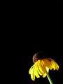
| 09/17/2005 03:24:26 AM | Susanby esdarbyComment: Greetings from the Critique Club.
It's such a stark, mimimalistic image that there's not much material for a critique! Especially as the commentators during voting seem to have covered everything anyway. The composition is interesting and seems to me particularly appropriate for the wilted-looking flower (it's a Black Eyed Susan, I suppose). It may not have been your intention, but the effect created is of a battered but determined flower struggling to fight its way into the frame! I normally have a (perhaps irrational) dislike of flower photographs; they offer the intellectual and emotional challenge of a TV test pattern, as far as I'm concerned. But you have found a way to inject your flower image with personality and pathos, and I applaud you for that. I've seen your portfolio, and I know that you are a masterful flower photographer. But I've also seen your non-flower images, many of which are intensely emotional and artistically adventurous, so I'm not surprised that you've found a way to make a flower appealing even to a philistine like me.
Cheers,
Paul Martin | | Photographer found comment helpful. |
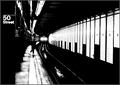
| 09/16/2005 09:27:53 PM | Uptown on the E Trainby HRoxasComment: Bonjour Henry ... and greetings from the Critique Club!
I'm especially pleased to have drawn this image for review, for several reasons.
First because I voted it 10 (see below), so I can now explain my enthusiasm in more detail.
Second because it attracted the attention of several commentators whose work and judgement I particularly admire.
Third because it's such a superb example of street photography that I had expected the photographer would be revealed as one of DPC's particular masters of that genre (e.g. JPR, who felt you "should have placed much higher") ... but your portfolio demonstrates a similar level of skill across just about every type of photography. So I hope readers of this will be encouraged to take a look at all your work and learn.
Now, the image itself:
The composition is effective, if nearly inevitable for the location & subject. Leading lines and the rule of thirds are elegantly acknowledged, but not to the point of cliche ... you have properly relegated them to the rhythm section, while your soloists take the spotlight. And I use the musical metaphor advisedly, because I feel this image and good jazz are bedfellows. Take the wonderful recurring dark/light pattern on the wall ... it's strongly suggestive of a piano keyboard of course, and given that your title recalls Ella Fitzgerald & Duke Ellington's "Take the A Train" (and various other A Train, E Train and J Train titles, as well as Billy Joel's "Uptown Girl"), there's a clever musical allusion that I think provides the dominant figurative theme of this work.
The inclusion of the 50th Street location sign on its vertical band of black is also clever; "50 Street" makes a good subtitle for the photograph, and the black band provides a visual buffer on the quiet side of the image, thus making the opposite, open side of the scene all the more dynamic.
The inclusion of the human figure is an interesting question ... one commentator felt it may be a mistake. I can't agree. This oddly-dressed man, positioned far enough away to not dominate to image, but just close enough to retain some personality, adds to the evocative, uneasy spirit of the scene applauded by another commentator.
And there's a marvellous "image within an image" to enjoy as well ... the tracks, the puddles and train headlights form in themselves a fascinating little cameo.
As for the challenge ... of course your photograph is powerfully High Contrast, and not just because that was the challenge theme, but because it really had to be.
Cheers,
Paul Martin
(edit for typo) Message edited by author 2005-09-16 23:10:26. | | Photographer found comment helpful. |
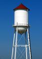
| 09/15/2005 07:23:51 PM | Old watertower--new face.by VanGoghComment: Greetings from the Critique Club.
This stark image is a bit difficult to evaluate. I find it kind of ambiguous ... it's centred, it's severed from the earth, and it's presented square-on (i.e. you have chosen to eschew dramatic perspective). These three factors together, at least on a superficial level, combine to supress the subject's potential for initial interest. However, your compositional choices are clearly deliberate, and the thoughtful viewer is therefore obliged to set aside first impressions and consider whether there is something deeper at work here. It's possible to construct several convincing allegorical interpretations of the image, especially in respect of the decision to brutally sever the subject from its support or foundation, creating a kind of disembodied alarm. But the interpretation that I actually prefer is the one implied by your title; the anthropomorphic appearance of the structure ... the 'hat' recalls the Tin Man from the Wizard of Oz, which I guess actually makes it an anthropomorphic double entendre!
From a purely technical point of view, it's nicely exposed and quite sharp enough, although the subject is leaning to starboard a bit, and the post and wire at the bottom could have been profitably removed in editing.
Finally, does it satisfy the High Contrast challenge theme? Yes, I think so. There's a reasonable presence of tonal contrast, but of course there is also a very strong colour contrast.
My final evaluation: It's a more interesting image than it first appeared. Not exactly to my taste, but I have a suspicion that that could be my problem, and not yours!
Cheers,
Paul Martin |
| 09/15/2005 08:27:55 AM | Lavatara in Darknessby jbsmithanaComment: Hi JB ... and greetings from the Critique Club.
Well, you've already acted on the selection artifact issue, so let's forget that. Except don't be too hard on yourself about it; this is an awfully difficult subject to select cleanly, especially when you're going for a clean black background! Now, the rest. The composition is terrific ... not just the thirds thing, but the careful inclusion of the edge-on bloom at lower left and the two buds above the main bloom. Not only artistically satisfying, but botanically meticulous as well! The actual image of the primary bloom is also very good; immaculately exposed and crisply focused in all the right places. The evening light was well chosen to accentuate the soft, flourescent glow of the petals. And of course from a challenge theme point of view, it could hardly be any more impressive; the colour contrast and the tonal contrast are spectacular.
I can offer no other constructive criticism; the selection stuff aside, it's simply a very fine image.
Cheers,
Paul | | Photographer found comment helpful. |
| 09/15/2005 07:31:25 AM | Vantageby aznymComment: G'day X,
I usually score your stuff very high, but I must admit I gave this a lousy six. More fool me! It's as rivetting as all your work; I just blundered ... must have had a couple of extra whiskies that night and just stumbled by with my senses dulled. So, apologies for an unworthy score and thanks for another of your demanding but rewarding masterpieces! P. | | Photographer found comment helpful. |
|
Showing 3321 - 3330 of ~4143 |
Home -
Challenges -
Community -
League -
Photos -
Cameras -
Lenses -
Learn -
Help -
Terms of Use -
Privacy -
Top ^
DPChallenge, and website content and design, Copyright © 2001-2025 Challenging Technologies, LLC.
All digital photo copyrights belong to the photographers and may not be used without permission.
Current Server Time: 08/15/2025 03:34:57 AM EDT.
|